Cluster analysis or clustering is the task of grouping a set of objects in such a way that objects in the same group (called a cluster) are more similar to each other than to those in other groups (clusters) (source: Wikipedia). Cluster analysis is usually used to make sense of large samples of observations by grouping them by similar behaviour. For example: we have the idea that we can group customers by the kinds of articles they buy, but the large population of customers does not let us readily see how these groups are formed, or even if there are any such groups.
This tutorial shows you how you can do a cluster analysis for your data set, evaluate it and display it’s results.
The road to cluster analysis

Clustering is all about similarity. So a first step in cluster analysis looking at similarity by calculating similarity between the observations in your data set and then visualizing it. You can follow all in this tutorial without knowing more about visualizing similarity.
The last step before the actual clustering is assessing clusterability or our data. This is explained in the section Determining clusterability
Determining similarity

If we want to group observations by similarity, we need a measure(s) of their similarity; in the statistics field the reverse of similarity is used: distance measures. The distance measure used highly impacts the form of the clusters and the clustering method we can use. The choice of your distance metric is determined by the measurement levels of the variables in your data set. (If you need a refresh on measurement levels, you can find a quick explanation here.) There are many distance metrics, but the four I found most useful are discussed here.
In relation to similarity correltion coefficients are often mentioned, which are similarity measures instead of distance measures. They can also be turned into distance measures by subtracting them from zero, but I’ll skip a discussion about those here since most cases will be covered by those used here.
Euclidian distance
The Euclidian distance is the distance measure we’re all used to: the shortest distance between two points. This distance measure is mostly used for interval of ratio variables. Be careful using this measure, the distance can be highly impacted by outliers, throwing your clustering off. The distances are calculated by the dist function, passing the value “euclidian” to the method argument:
str(USArrests)
dist_USArrests <- dist(USArrests, method = "euclidian")
Manhattan distance

The Manhattan distance is called after the shortest distance a taxi can take through most of Manhattan, the difference from the Euclidian distance: we have to drive around the buildings instead of straight through them. This distance measure is useful for ordinal and interval variables.
For an example we cluster the countries by the religions of their people in 2010, for which I’ve used the data from the Correlates of War Project.
dist_religion <- dist(df_country_by_religion[, -c(1:3)], method = "manhattan")
Hamming distance
The Hamming distance the number of positions between two strings of equal length at which the corresponding symbols are different. This is useful for categorical variables.
Jaccard distance
Jaccard distance is the inverse of the number of elements both observations share divided (compared to), all elements in both sets (think Venn diagrams). This is useful when comparing observartions with categorical variables. In this example I’ll be using the UN votes dataset from the unvotes library. Here we’ll be looking at similarity in voting on UN resolutions between countries.
First we prepare the data by combining the votes with the roll calls, so we know which UN resolutions are being voted for. We’ll just take the important votes. We’ll just focus on the UN resolutions voted on between 2005 and 2015. Then the votes are recoded, so a yes becomes a 1, a no a 0 and all abstains will be missing values (i.e. NA). The variables are selected that matter to the analysis: the country, the UN resolution reference and the vote. The resolutions then get rotated to being variables, so for each country is a row where the vote for each UN resolution is a variable.
library(unvotes)
library(lubridate) # For the year extraction function

df_country_votes <- un_votes %>%
  inner_join(un_roll_calls, by ="rcid") %>%
  filter(importantvote == 1) %>%
  mutate(year_vote = year(date)) %>%
  filter(year_vote >= 2005 & year_vote <= 2015) %>%
  mutate(vote_no = ifelse(vote == "yes", 1, ifelse(vote == "no", 0, NA)))  %>%
  select(unres, country_code, vote_no) %>%
  spread(unres, vote_no)
The Jaccard distance matrix can be created using the vegdist function of the vegan library.
library(vegan)
dist_matrix <- vegdist(df_country_votes[, -c(1,2)], method = "jaccard", na.rm = TRUE)
A intuitive way of exploting the Jaccard distances, you can use the MDS section. Knowing how much the countries are similar in voting behaviour is nice, but they give a confusing picture of 193 data points. I’d like to have a better overview of countries that are more similar than others. Here’s where clustering comes to the resue! Jaccard distances can be used as input for hierarchical and PAM clustering. If you want to follow through on this example on UN voting you can jump to the PAM section.
Gower distance
Gower’s General Similarity Coefficient one of the most popular measures of proximity for mixed data types. For each variable type, a particular distance metric that works well for that type is used and scaled to fall between 0 and 1. Then, a linear combination using user-specified weights (most simply an average) is calculated to create the final distance matrix. Calculating the
Applying multidimensional scaling
MDS

- Squeezing distances in n-dimensions in 2-dimensions
- Each time refitting points on two-dimensions
- Trying to minimizing stress
- Stress: Difference between original and squeezed distances You can perform a classical MDS using the cmdscale function.
str(USArrests)
dist_USArrests <- dist(USArrests, method = "euclidian")
mds_USArrests <- cmdscale(dist_USArrests, eig = TRUE, k = 2)
Choosing a clustering algorithm
So here’s your decision tree:
- If your distance is squared Euclidean distance, use k-means. This is because, since the k-means algorithm tries to minimize variance of Euclidian distances from the center of a cluster.
- If your distance is Manhattan distance, use k-medians
- If you have any other distance, use k-medoids
| Function | Complete | Exclusive | Fuzzy | Hierarchical | Partitioned | Interval/ratio | Ordinal | Categorical |
|---|---|---|---|---|---|---|---|---|
| cmeans | 1 | 0 | 1 | 0 | 1 | 0 | 0 | 0 |
| fanny | 1 | 0 | 1 | 0 | 1 | 0 | 0 | 0 |
| hclust | 1 | 1 | 0 | 1 | 0 | 1 | 1 | 1 |
| kmeans | 1 | 1 | 0 | 0 | 1 | 1 | 0 | 0 |
| pam | 1 | 1 | 0 | 0 | 1 | 1 | 1 | 0 |
Library fpc
clustermethod argument:
| Method | function | Input |
|---|---|---|
| hclustCBI | hclust | Matrix of observations * variables |
| disthclustCBI | hclust | Distance matrix |
| claraCBI | pam\clara | Matrix of observations * variables or distance matrix |
Data preparation
Scaling
The value of distance measures is intimately related to the scale on which measurements are made.
Determining clusterability
Hopkins statistic
Means clustering
Choosing k
The k-means clustering algorithm splits the data into a set of k clusters, where k must by us. Each cluster is represented by means of points belonging to the cluster, the so-called medioid. Although we have the final say what k must be, it is cannot be based on wish thinking. The optimal k is determined by similarity of objects: objects within a cluster should be as similar as possible, whereas objects from different clusters should be as dissimilar as possible.
The factoextra library cotains a lot of goodies in respect to clustering, one of which is a function which helps us determine k visually by plotting the GAP statistic
kmeans(x, centers, iter.max = 10, nstart = 1)
Median clustering
Mediod clustering
PAM for Jaccard distances
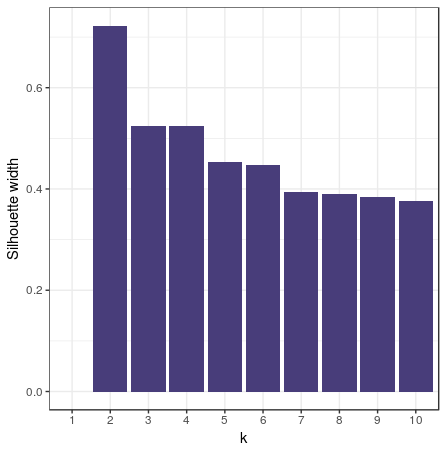
Remember the UN votes example from the section on Jaccard distances? Let’s go a step further and see if there are voting blocks by clustering this data. First we’ll have to choose the number of clusters. To do this we’ll perform the PAM clustering for 2 to 10 clusters, gathering the silhouette width.
sil_width <- c(NA)
for(i in 2:10){
  pam_fit <- pam(dist_matrix,
                 diss = TRUE,
                 k = i)
  sil_width[i] <- pam_fit$silinfo$avg.width
}
Visualizing the gathered silhouette widths is done with this code:
df_pam_sil <- data.frame(k = c(1:10), sil_width)

ggplot(df_pam_sil, aes(x = k, y = sil_width)) +
  geom_col() +
  labs(y = "Silhouette width")

pam_fit <- pam(dist_matrix, diss = TRUE, k = 4)
df_country_votes$pam_cluster <- factor(pam_fit$clustering)
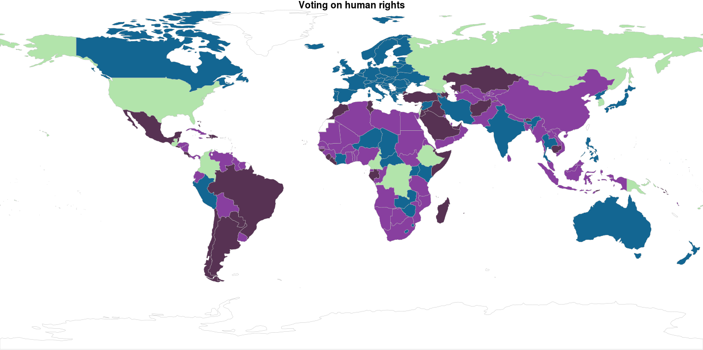
In other clustering methods we use the MDS solution to display the clusters, but plotting 193 countries in a plot like that delivers a big mess of points, while we understand countries better as plotted in a world map. So: let’s do this! The library rworldmap makes it quite easy to do this as long as you van ISO coded country codes in your data set, which luckily, the unvotes data set has. Below we load the library, and ‘join’ the data frame df_country_votes with the pam_cluster variable and the ISO2 coded country_code variable to our world map:
library(rworldmap)

mapped_data <- joinCountryData2Map(df_country_votes,
                                   joinCode = "ISO2",
                                   nameJoinColumn = "country_code",
                                   suggestForFailedCodes = TRUE)
The palette cbbPalette is created to fill our colors on the world map. The mapCountryData function is called supplying the data set mapped_data you’ve just created. The string pam_cluster is passed to the nameColumnToPlot parameter to make the colors match up with the cluster. Note that the colourPalette parameter gets the slightly weird subset of the cbbPalette colors by using the argument cbbPalette[1:length(pam_fit$medoids)]; this is done so the numbers of colors in the palette matches the number of clusters. Otherwise the colors will be interpolated, which could give you results you’re not quite happy with.
cbbPalette <- c("#000000", "#E69F00", "#56B4E9", "#009E73", "#F0E442", "#0072B2", "#D55E00", "#CC79A7")

par(mai=c(0,0,0.2,0),xaxs="i",yaxs="i")

mapCountryData(mapped_data,
               nameColumnToPlot = "pam_cluster",
               colourPalette = cbbPalette[1:length(pam_fit$medoids)],
               mapTitle = "UN Voting clusters 2005-2015",
               catMethod = "categorical",
               addLegend = FALSE)
Does this seem about right? American seems like a pretty lonely country: they are a cluster on themselves? Well… Not quite. If you zoom in on the map, you see a small sliver on the Mediterranean Sea… Isreal. Is this surprising? Throwing all UN resolutions in the same clustering algorithm is a rather brute force approach. We’d like to know more about the subjects of the resolutions before clustering. The good thing: you can be more specific by joining the un_roll_call_issues data-set in the process and be more precise about the subjects clusters of countries agree on. If it would be my profession I’d probably add own variables in there as well… But uhm… I have a tutorial to finish.
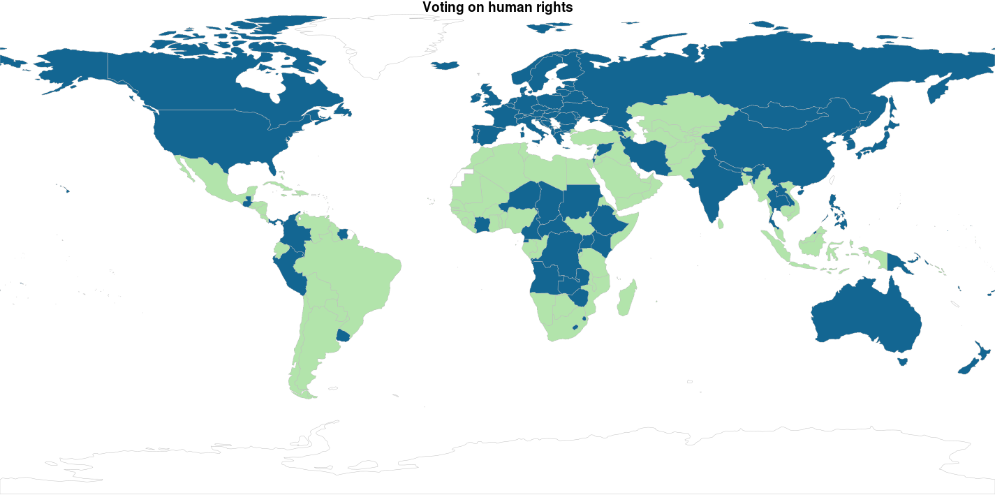
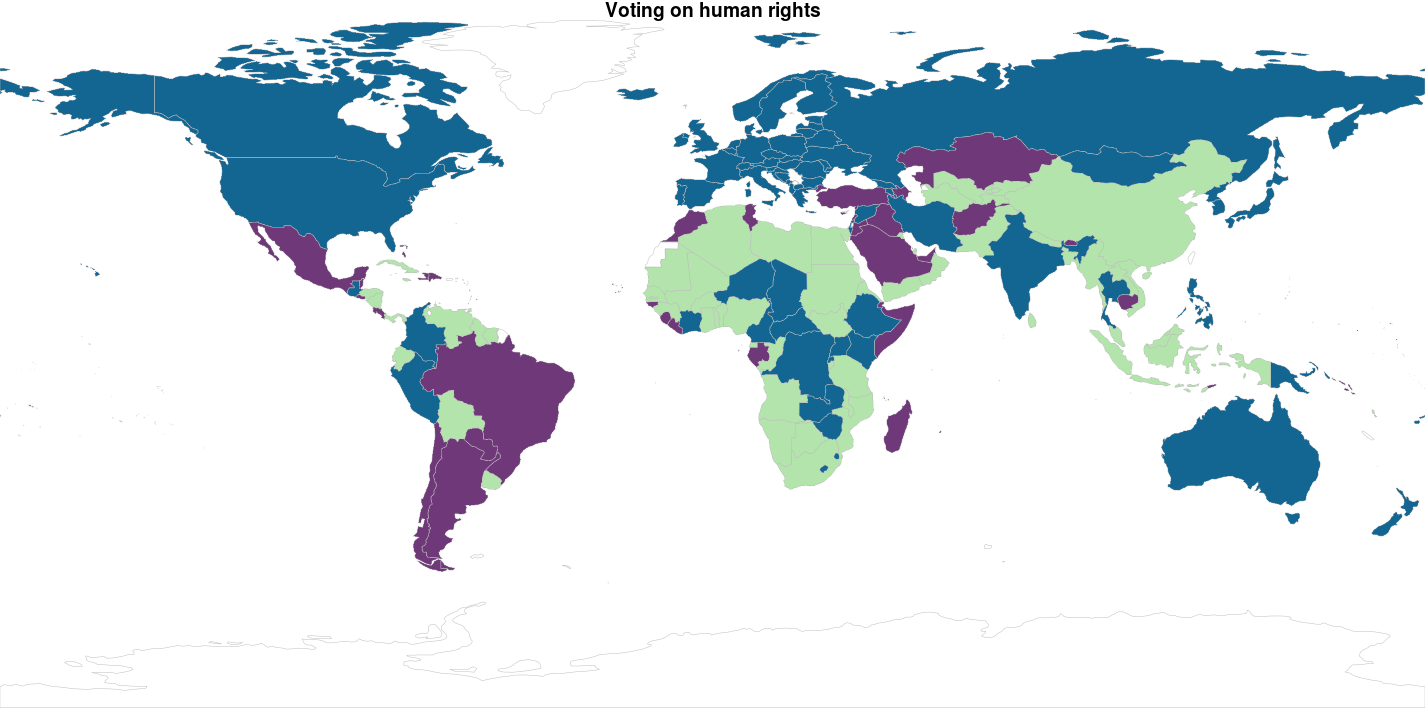
Ok… Since I didn’t really explain why I got to 4 clusters instead of 2…. There is no reason for it… So here are k = 2 and k = 3
Hierarchical clustering
Evaluating clustering
-
Internal measures, which uses intrinsic information in the data to assess the quality of the clustering. Internal measures include the connectivity, the silhouette coefficient and the Dunn index.
-
Stability measures, a special version of internal measures, which evaluates the consistency of a clustering result by comparing it with the clusters obtained after each column is removed, one at a time.


