Cross tabs
To see cross-tabulations with frequencies you can use the statement below, do also all table entries can be found that didn’t contain any value.
table(colum_values_rows, column_values_across, useNA = "ifany")
The library janitor allows you to do crosstabs withing the tidy framework like this:
mtcars %>%
  crosstab(cyl, gear)
Unlike the table function, this will show any missing values by default. If you want to hide this, you can pass FALSE to the parameter show_na.
If you’d like to add totals to your crosstab you can use the function adorn_totals:
mtcars %>%
  crosstab(cyl, gear) %>%
  adorn_totals()
| cyl | 3 | 4 | 5 | Total |
|---|---|---|---|---|
| 4 | 1 | 8 | 2 | 11 |
| 6 | 2 | 4 | 1 | 7 |
| 8 | 12 | 0 | 2 | 14 |
| Total | 15 | 12 | 5 | 32 |
If you’d like to add row, column or totalwise percentages you can use the adorn_crosstab function and pass the values “row”, “col” and “all” to the denom parameter. Below is an example of a column percentage:
mtcars %>%
  crosstab(cyl, gear)%>%
  adorn_crosstab(denom = "col")
| cyl | 3 | 4 | 5 |
|---|---|---|---|
| 4 | 6.7% (1) | 66.7% (8) | 40.0% (2) |
| 6 | 13.3% (2) | 33.3% (4) | 20.0% (1) |
| 8 | 80.0% (12) | 0.0% (0) | 40.0% (2) |
Spotting duplicates
Before doing any analysis I often check if there are duplicate observations in my data. I used to do this by creating a temporary table, with a counter and then joining on it. Since I’ve found the get_dupes function from the janitor library, I don’t have to do all that anymore. If I want to see all rows that are duplicates for the key rows key1 and key2 (etc.) I can use this command:
tbl_data %>%
  get_dupes(key1, key2)
Correlation matrices are boring
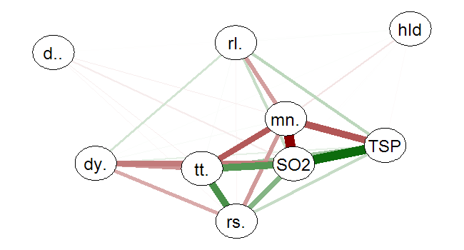
When making correlation matrices to inspect possible relations between variables, I often get scared by the table I get. Using the following pseudo code, you can plot the correlation matrix in a network graph that is less daunting to look at, using the qgraph library:
library(qgraph) # Loading the library
library(SemiPar) # Library just used for the data
data(milan.mort) # Making data available
corr_matrix=cor(milan.mort) # Making a correlation matrix
qgraph(corr_matrix,
       shape="circle",
       posCol="darkgreen",
       negCol="darkred",
       layout="spring",
       vsize=10) # Creating the network graph
Positive correlations are depicted as green lines, and negative are red, the width of lines show the strength of the relationship.

ROC, AUC and Gini
There are packages available for creating a ROC and calculating the AUC and Gini statistic, but since I don’t like installing and loading packages for every small thingy I created my own function for doing exactly that:
create_ROC <- function(observed, predicted, threshold_step_size = 20){

  TPR <- NULL
  FPR <- NULL
  threshold <- rev(seq(0, 100, threshold_step_size))
  threshold <- threshold / 100

  for(i in threshold){
    TPR <- c(TPR, sum(predicted >= i & observed == 1)/sum(observed == 1))
    FPR <- c(FPR, sum(predicted >= i & observed == 0)/sum(observed == 0))
  }

  n <- length(TPR)
  auc <- sum( ((TPR[-1] + TPR[-n]) / 2) * (FPR[-1] - FPR[-n]) )
  gini <- 2 * auc - 1

  roc <- list(auc = auc,
              gini= gini,
              roc_data = data_frame(threshold, TPR, FPR))

  return(roc)
}