Sooner or later during an analysis I’ll start asking myself: how similar are these observations really? If we want see how similar observations are, we need a measure of their similarity; in the statistics field a reverse term of similarity is used: distance measure. There are many, many distance metrics, but the four I found most useful are discussed here.
This tutorial shows you how to pick a distance metric, how to apply it and how to visualize is using MDS or t-SNE (in one case). I won’t go into MDS too deeply, but you can follow my tutorial on MDS here if you want to.
How to choose a distance measure
There are different distance metric to choose from, and your choice is mostly determined by the measurement levels of the variables in your data set. (If you need a refresh on measurement levels, you can find a quick explanation here. The table below shows you which measurement level corresponds to which distance measure.
| Measurement level | Method |
|---|---|
| Categorical | Jaccard |
| Ordinal | Manhattan |
| Interval Ratio | Euclidean |
| Mixed levels | Gower |
Jaccard distance
Jaccard distance is the inverse of the number of elements both observations share compared to (read: divided by), all elements in both sets. The the logic looks similar to that of Venn diagrams. The Jaccard distance is useful for comparing observations with categorical variables. In this example I’ll be using the UN votes dataset from the unvotes library. Here we’ll be looking at similarity of countries and their voting behaviour for UN resolutions on human rights issues.
First we prepare the data by combining the votes with the roll calls, so we know which UN resolutions are being voted for. Some country data is added. Then the data is filtered out, just focussing on the important votes for human rights related resolutions. The votes that have no recognizable country codes are removed. Then the votes are recoded, so a yes becomes a 1, a no a 0 and all abstains will be recoded to 99. The variables are selected that matter to the analysis: the country, the UN resolution reference, the date of the vote and the vote itself.
library(unvotes)
library(lubridate) # For the year extraction function

df_country_votes <- un_votes %>%
  inner_join(un_roll_calls, by ="rcid") %>%
  inner_join(un_roll_call_issues, by = "rcid") %>%
  select(-country) %>%
  left_join(df_country, by = "country_code") %>%
  filter(importantvote == 1 &
           issue == select_issue &
           !is.na(country_code) ) %>%
  mutate(vote_no = ifelse(vote == "yes", 1, ifelse(vote == "no", 0, 99))) %>%
  select(date, unres, country, vote_no)
We can create our own Jaccard distance matrix by making a comparison of each of the resolution votes for all country pairs.
- First df_country_votes is joined with itself, joining on the date of the vote and UN resolution.
- Then we see for each country pair, whether the votes match or not.
- Then all country pairs are grouped
- The Jaccard similarity is calculated by: \(\text{Jaccard similarity} = {|\text{votes}_\text{country a} \bigcup \text{votes}_\text{country b}| \over |\text{votes}_\text{country a} \bigcap \text{vote}_\text{country b}|}\) , where $\bigcup$ stands for the votes where they agree, and the $\bigcap$ stands for all votes from both countries, irrespective whether they were similar or not. The $|$ surrounding the terms indicates they should be counted. The Jaccard similarity is turned into Jaccard dissimilarity by subtracting it from 1: \(\text{Jaccard dissimilarity} = 1-{|\text{votes}_\text{country a} \bigcup \text{votes}_\text{country b}| \over |\text{votes}_\text{country a} \bigcap \text{vote}_\text{country b}|}\)
- The countries are then spread across to we have a matrix of countries by countries with their Jaccard distance.
df_country_jaccard <- df_country_votes %>%
  inner_join(df_country_votes, by = c("date", "unres")) %>%
  mutate(is_same = vote_no.x == vote_no.y)%>%
  group_by(country.x, country.y) %>%
  summarise(jaccard_distance = 1 - sum(is_same)/n()) %>%
  ungroup() %>%
  rename(country = country.x) %>%
  spread(key = "country.y", value = "jaccard_distance")
Visualizing similarity
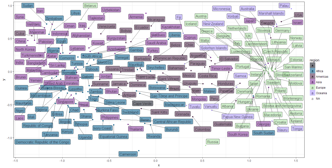
To get an idea of how similar the countries are in terms of UN votes for Human Right issues I’d like to see a plot in which the more similar countries are closer together and unsimilar countries further apart. The plot below was what I was aiming for:
How did I create this plot? For this to work the the 196 dimensions (each country is a variables) in the similarity matrix, the matrix needed to be reduced to a two dimensional ‘summary’ of the similarity between countries. To tackle this issue I turn to a non-metric MDS function metaMDS of the vegan library. _(for more information, look up the MDS tutorial):
mds_country_votes <- metaMDS(dist_matrix)
Then the mds solution is combined with some of the original country data, so we can start plotting after that:
df_mds_country_votes <- data.frame(x = mds_country_votes[,1],
                                   y = mds_country_votes[,2],
                                   country = df_country_votes$country,
                                   region = df_country_votes$region,
                                   sub_region = df_country_votes$sub_region)
Now for the final ggplot statement, which will get you the above result. I’ve used the ggrepel library for it’s geom_label_repel function to create the non-overlapping labels.
library(ggrepel)
ggplot(df_mds_country_votes,aes(x, y)) +
  geom_jitter(aes(col = region)) +
  geom_label_repel(aes(label = country, fill = region), alpha = .6)
We can see there are certain groups of countries that are more similar than others, which gives a hint there might be clusters of countries that share voting patterns. There is clearly a majority of European countries that seem to share opinions on Human Rights. What sets this cluster apart from the rest? How does this relate to other country metrics like the Human Freedom Index of the CATO Institute? Seeing how easy it is to get the data, it was very tempting to start crunching on that… but, uhm…. I have a tutorial to finish, so I’ll leave that challenge up to you.
This link will give you the entire script for a running example you can play around with yourself, and maybe add the Cato Institute data.
Manhattan distance
The Manhattan distance is called after the shortest distance a taxi can take through most of Manhattan, the difference from the Euclidian distance: we have to drive around the buildings instead of straight through them. This distance measure is useful for ordinal and interval variables, since the distances derived in this way are treated as ‘blocks’ instead of absolute distances.
For an example we’ll be looking at the similarities of countries in terms of their religious make-up in 2010, for which I’ve used the data from the Correlates of War Project.
I won’t be describing all the steps in acquiring the data, just the parts that are about creating distances and visualizing them. You can download the script, if you want to play around with it yourself.
The distances are calculated by the dist function, passing the value “manhattan” to the method argument:
dist_religion <- dist(df_country_by_religion[, -c(1:3)], method = "manhattan")
Visualizing similarity
Now we have a distance object which countains a crossing of all countries in terms of their similarity. If we’d want to visualize that we need to visualize 192 countries with their intercrossed similarities. This is way too difficult, so we resort to MDS two scale all these similarities back to two dimensions, which we can use in a scatter plot. The cmdscale function only takes a matrix, not a distance object, so we need to convert that first:
mat_distance <- as.matrix(dist_religion)
Then we can perform the MDS, where the default will create 2 dimensions:
mds_religions <- cmdscale(mat_distance)
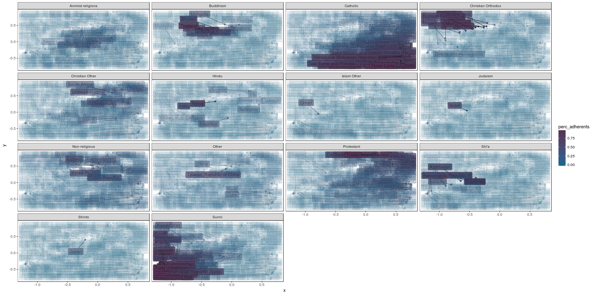
Then we combine this MDS solution with the original data frame, which we can use to create the similarity plot. The religion adherence values from the original data frame will be translated to rows, so we can create a seperate plot for all religions, seeing their impact on the similarity:
df_mds_religions <- cbind(df_country_by_religion,
                          x = mds_religions[,1],
                          y = mds_religions[,2])

df_mds_religions %<>%
  gather(key = "religion", value = "perc_adherents", -country, -iso_alpha_3, -x, -y)
Then we have the command creating our plot:
ggplot(df_mds_religions, aes(x, y)) +
  geom_jitter(aes(col = perc_adherents, alpha = perc_adherents)) +
  geom_label_repel(aes(label = country, fill = perc_adherents, alpha = perc_adherents)) +
  scale_color_continuous() +
  scale_fill_continuous() +
  facet_wrap(~religion)
Well… That is a pretty ‘busy’ graph, which probably can be improved upon. But is does show how countries with similar religious make-up are pretty close together in specific areas of the plot, so this data set looks like a good candidate for clustering. We could we cluster the countries by their similarity, and plot them on a world map instead of a scatter plot and that might tell us more. This is exactly what I’ve done for the clustering tutorial.
Euclidean distance
The Euclidean distance is the distance measure we’re all used to: the shortest distance between two points. This distance measure is mostly used for interval or ratio variables. Be careful using this measure, since the euclidian distance measure can be highly impacted by outliers, which could also throw any subsequent clustering off.
The data set we’ll be using for the euclidian distance measure is a data set about crime rates in cities of the USA from 1973. It contains variables about violent crime rates per 100.000 residents for assault, murder, and rape.
When your data set contains multiple variables, chances are they contain different measures (while being all of the interval or ratio level); in this example we do not only have crime rates per 100.000 residents, but also a variable for the percentage of the population considered urban. It might happen that one of the variables, with the largest range of values, might ‘kidnap’ the whole distance measure. To prevent this from happening you need to scale and center your data with R’s native scale function, ensuring all variables equally represented in the distance measure:
scaled_USArrests <- scale(USArrests)
The distances are calculated by the dist function, passing the value “euclidian” to the method argument:
dist_USArrests <- dist(scaled_USArrests, method = "euclidian")
Visualizing similarity
Now we have a distance matrix, we might want to explore the similarities visually. Here we use MDS (for more on that subject, see the MDS tutorial) to get the 4 dimensional similarity matrix down to two dimensions we can visually interpret. First we convert the distance object to a normal matrix which can be used by the cmdscale function.
mat_USArrests <- as.matrix(dist_USArrests)

mds_USArrests <- cmdscale(mat_USArrests, eig = TRUE, k = 2)  # Perform the actual MDS
Then we combine the data set with the MDS solution to a data frame we can use for our plot:
df_mds_USArrests <- data.frame(city = row.names(USArrests),
                               scaled_USArrests,
                               x = mds_USArrests$points[,1],
                               y = mds_USArrests$points[,2])
Since we want to see how all variables impacted the MDS solution we’ll rotate the variables so they become different data sets we can use to make a plot for each variable, through ggplot’s facet function.
df_mds_USArrests %<>%
  gather(key = "variable", value = "values", -city, -x, -y)
Then we can finally create the plot. Note how the values variable and variables variable is used in the facet function are used so we can get a look at the impact of all variables:
ggplot(df_mds_USArrests, aes(x, y)) +
  geom_jitter(aes(col = values, alpha = values)) +
  geom_label_repel(aes(label = city, fill = values, alpha = values)) +
  facet_wrap(~variable)
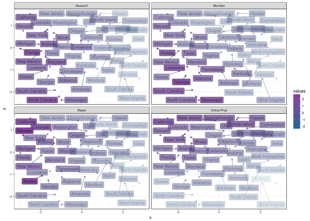
This creates the plot below, where the cities are plotted by similarity and their respective crime rates and population are indicated by their opacity. We can see here is that the distances across the X axis tells us a lot about assault: the left side shows high assault rates. The rape and murder rates are highest in the top left and lower left corners respectively. It seems Assault is prevalent in cities where rape and murder is also prevalent, but rape and murder are not prevalent across the same cities. The y axis represents differences in urban population percentages, it seems urban population and crime rates are not necessarily related.
It seems approaching similarities in this way already told us a lot about this data set, and should give some directions on which statistical tests mightt be done to do to see if you can confirm any the semi ‘hypotheses’ just made… Carrying on…
This link will give you the entire script for a running example you can play around with yourself.
Gower distance
 Gower’s General Similarity Coefficient is one of the most popular measures of proximity for mixed data types.
For each variable type, a particular distance metric that works well for that type is used and scaled to fall between 0 and 1. Then, a linear combination using user-specified weights (most simply an average) is calculated to create the final distance matrix.
Calculating the Gower distance matrix in R can be done with the daisy function from the cluster package.
To show how this procedure can be done in R I’ve found this movie dataset I’ve found here. This movie data set contains numerical variables like rating and number of votes, as well as categorical values about the movie’s genre. We’ll use the Gower distance measure on this dataset. Here’s how we get the data set:
url <- "http://vincentarelbundock.github.io/Rdatasets/csv/ggplot2/movies.csv"
df_movie <- read.table(file = url, header = TRUE, sep = ",")
The df_movie data frame contains some columns I considered unnecessary and some needed to be recoded to factor variables so they are treated appropriately by the distance function:
df_movie %<>%
  dplyr::select(-X, -c(r1:r10), -mpaa, -budget) %>%
  mutate(Action = factor(Action), Animation = factor(Animation), Comedy = factor(Comedy),
         Drama = factor(Drama), Documentary = factor(Documentary), Romance = factor(Romance),
         Short = factor(Short))
Since the movie data set is pretty big, wel’ll just create a random sample of 2000 movies, since I’m just demonstrating an idea here:
df_movie_selection <- df_movie[sample(nrow(df_movie), 2000),]
Next we’ll calculate the similarities between the movies
library(cluster)
dist_gower <- daisy(df_movie_selection[, -1],
                    metric = "gower",
                    type = list(logratio = 3))
How does this similarity landscape look? Let’s take a peek using MDS. In order to get the MDS cmdscale function to work we need to convert the distance object to a regular matrix:
mat_gower <- as.matrix(dist_gower)
Visualizing similarity
Using MDS
Next we’ll get a MDS solution, mds_movies, with 2 dimensions to plot
mds_movies <- cmdscale(mat_gower, eig = TRUE, k = 2)
and convert it to a data frame we can use with ggplot in the desired way:
df_mds_movies <- data.frame(df_movie_selection,
                            x = mds_movies$points[,1],
                            y = mds_movies$points[,2])

df_mds_movies %<>%
  dplyr::select(title, x, y, year, rating, Action, Animation,
                Comedy, Drama, Documentary, Romance, Short) %>%
  gather(key = "variable", value = "values", -title, -x, -y, -year, -rating)
The plot:
ggplot(df_mds_movies, aes(x, y)) +
  geom_jitter(aes(col = variable, alpha = values)) +
  facet_wrap(~variable) +
  guides(alpha = FALSE)
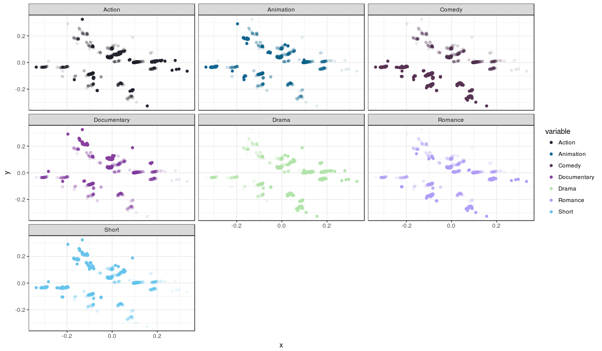
The movies are plotted by their similarity and each plot is a genre; the movies which are not part of a genre are transparent, while the movies that do fit that genre are opaque. Remember that movies can fit more than one genre, so it is useful to compare plots when trying to spot movies that fit more than one genre.
Although we can make out some stuff, like comedies being a pretty specific group, most points are heavily overlapping, making the plot nearly useless for interpretation. It seems the MDS solution doens’t help us in this case. Another method to visually represent is t-SNE, but it comes which with its drawbacks when it comes to interpretatiom; I will discuss this method, and its drawbacks, below.
Using t-SNE
t-SNE is one of the reduction methods providing another way of visually inspecting similaries in data sets. I won’t go into details of how t-SNE works, but it won’t hold is back from using it here. if you want to know more about t-SNE later, you can look at my t-SNE tutorial. Let’s dive right into creating a t-SNE solution:
library(Rtsne)

fit_tsne <- Rtsne(dist_gower,
                  is_distance = TRUE,
                  check_duplicates = FALSE,
                  pca = FALSE,
                  perplexity = 120,
                  theta = 0.5,
                  dims = 2)
Let’s take a look at some of the parametes there (there are a lot). Starting simple: the dist_gower is the distance object you just created and wanted to visualise, since its a distance object we need to inform the function that it is: is_distance. We know there are no duplicates, so we set check_duplicates to FALSE to save processing time. PCA… We’re not doing that here, so let’s turn it off: pca = FALSE. We want to get a 2 dimensional plot of the similarities so: dims = 2.
The t-SNE solution are put in a new data frame including the original data set:
df_tsne_vars <- as_data_frame(cbind(df_movie_selection,
                                    x = fit_tsne$Y[, 1],
                                    y = fit_tsne$Y[, 2]))
And prepare it for visual exploration by splitting the set by genre across rows like in the MDS case:
df_tsne_movies <- df_tsne_vars %>%
  dplyr::select(title, x, y, year, rating, Action, Animation,
                Comedy, Drama, Documentary, Romance, Short) %>%
  gather(key = "variable", value = "values", -title, -x, -y, -year, -rating)
Then we create the plot:
ggplot(df_tsne_movies, aes(x, y, col = values)) +
  geom_point(aes(alpha = values, col = year)) +
  facet_wrap(~variable)
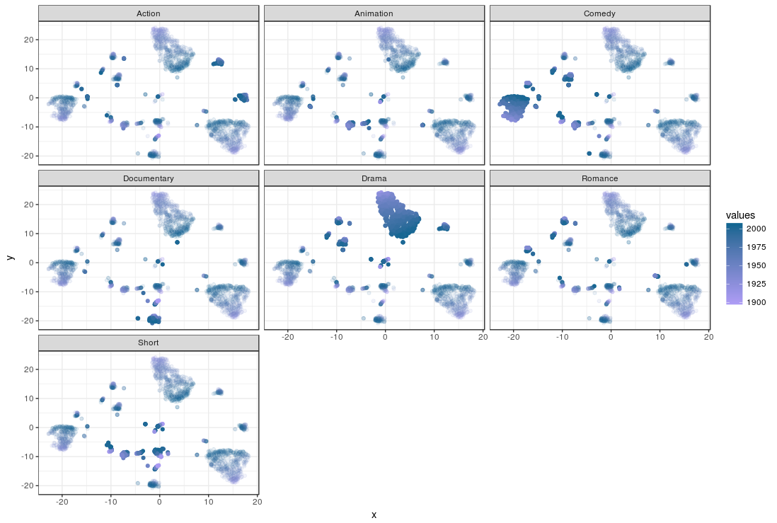
Again, the movies are plotted by their similarity and each plot is a genre; the movies which are not part of a genre are transparent, while the movies that do fit that genre are opaque.Remember that movies can fit more than one genre, so it is useful to compare plots when trying to spot movies that fit more than one genre. The color of the movies is determined by their first year of appearance.
The way in which similarites are represented are different from MDS in one fundamental way: t-SNE overrepresents similarity within a group, while it underrepresents between dissimilarity between groups. In other words: while MDS is more ‘honest’ in its similarity representation, t-SNE tends to agglomerate similar movies, and ignore how dissimilar unsimilar movies are. You can see what movies are similar and which are not in a t-SNE by looking at the clusters, but you can’t tell how different the clusters of movies are from one and other.
So comparing the plots we can quickly see the drama and comedy genres popping out by their ‘solidity’. There are also clusters that ‘light up’ on both the Drama and Comedy genres. The smaller but clear clusters for Documentaries and Action movies are more dark blue than light purple, which indicates they are relatively new genres. The t-SNE solution seems like a good candidate as input clustering, but I’ll leave that up to you.
• 0 Comments