Saving plots for publication
It’s all fun and games playing around with R for a while, but after some period I found out I actually had to get stuff out there: they call it work. I always thought the plots from R looked awesome, but working on my work laptop with Windows I found that the quality of the images was a bit dissapointing: I could see rough edges, giving the pictures a look like they came from the 90’s. So for a presentation I wanted to up my game: making them look beautiful includes making them pixel perfect. To do this you can surround your graph syntax by using the function png to precede your plot syntax and the dev.off function after the plot syntax like this:
png(
  file = "plot.png",
  type = "cairo",
  bg = 'transparent',
  units = "cm",
  width = 12.57,
  height = 12.57,
  pointsize = 18,
  res = 300
)
my_sc_plot(data)
dev.off()
- In the png function you pass the name you want to give your file to the filename argument (no shit Sherlock).
- The units argument can set the measurement level of the width and weight parameters. In this case I use centimeters (cm) since I’m using the output for a European PowerPoint file; so in this case the width and weight parameters specify the with and height of the output file in centimeters.
- The point argument let’s you specify the default size of the texts in the plot.
- The res argument is key for making them ‘pixel perfect’, the number you put here is the number of pixels you want tho squeeze in a square inch: the higher the better, but there is a limit. Play around with it to find your optimum.
ggplot
The snippets on the ggplot2 library have gotten so numerous that I’ve put them on their own page
Word clouds
The wordcloud library can be used like the following:
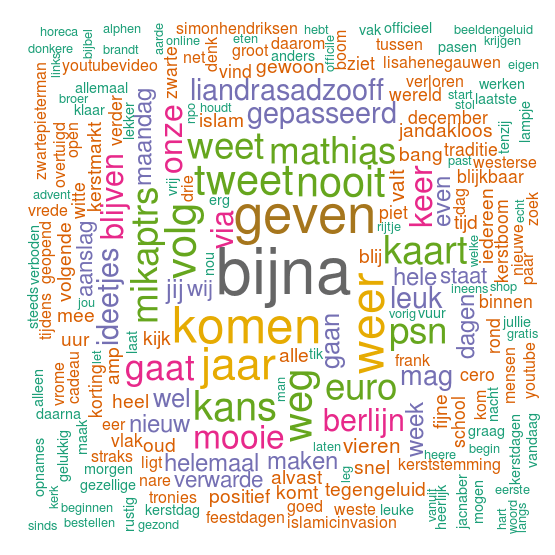
wordcloud(text, random.order = FALSE, colors = brewer.pal(8, "Dark2"))
The random.order variable specifies whether the most frequent word is plot first, or whether words are plot randomly. Passing the brewer.pal() function to the color parameter tells the wordcloud to use 8 colours from the RColorbrewer Dark2 palette:
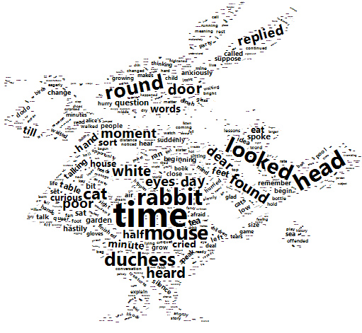
The wordcloud2 library offers more advanced formatting, even allowing you to define the shape of the wordcloud. The down-side? Slow as…. This example below, is coming from my tutorial Mining Alice’s Wonderland. Here a transparent PNG is used, in which the words of “Alice’s Adventures in Wonderland” is projected.
Network graphs
Networked graphs can be created using the ggraph library. I’ve created a tutorial with two examples of networked graphs, one of which looks like this:
Geographical plots
ggmap
With the ggmap library you can plot data on a Google Map or OpenStreetMap amongst others.
library(ggmap)
First you get the map picture from one of the services:
map_belgium <- get_map(location = "belgium",
                       zoom = 7,
                       maptype = "terrain",
                       source = "google",
                       color = "color")
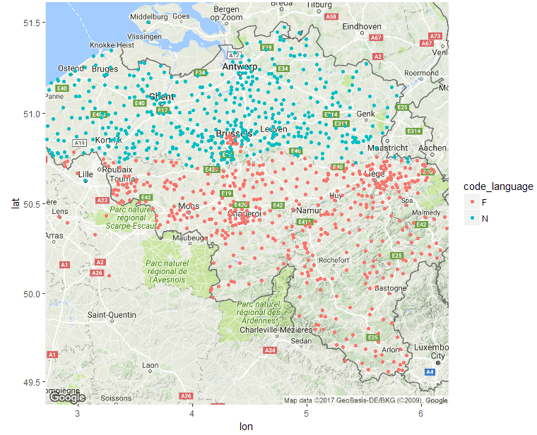
Most map graphing tools make you fill in longitudes and latitudes in advance, but this library allows you to use the map provider’s own search capabilities to add the longitudes and latitudes. Google Maps does limit the number of requests by 2.500 per call, so you might have to do some grouping. For example: I made a map of all Belgian companies, of which I happily used all company addresses to get the coordinates. Google thought I was overreacting making so many coordinate requests, so instead I aggregated the companies to countries and towns to perform the search:
tbl_towns <- tbl_market_base %>% # Aggregate the market to country/town
  group_by(country, town) %>%
  summarise(qty_companies = n())

coord <- geocode(paste0(tbl_towns$country, ", ", tbl_towns$town)) # Get coordinates
I pushed the enriched data back on the company data
tbl_towns <- cbind(tbl_towns,coord) %<>%
  left_join(tbl_towns, by = c("country", "town"))
and created this map:
ggmap(map_belgium) +
  geom_point(data = tbl_market_base, aes(x = lon, y = lat, colour = code_language ))
Raster maps
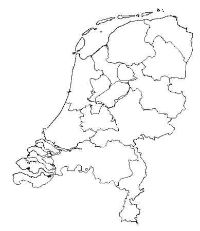
Countries can be divided in administrative districts. These can be accessed and plotted using the raster library. Country maps can easily be plotted using this code:
library(raster)
netherlands <- getData("GADM", country = "NLD", level = 1)
plot(netherlands)
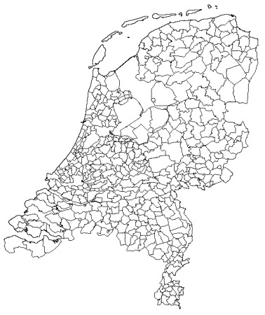
The level parameter determines the granularity of the administrative areas used. This above example shows the subdivision of The Netherlands in provinces. If we increase the level parameter by one we drill down to ‘gemeentes’
netherlands <- getData("GADM", country = "NLD", level = 2)
As you might expect, the country parameter specifies the country you want to view. The country parameter should be specified using the ALPHA 3 ISO code: http://www.nationsonline.org/oneworld/country_code_list.htm
Coloring raster maps
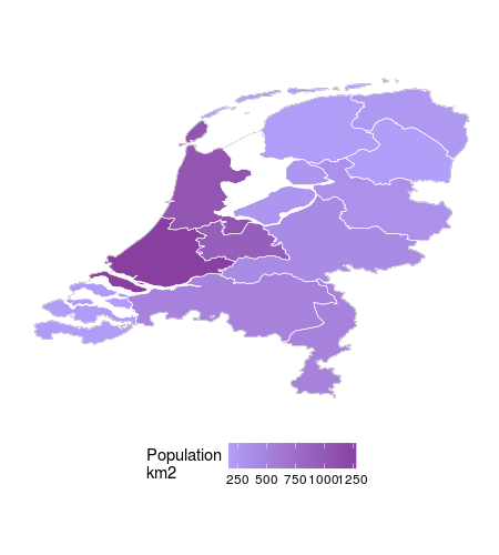
The entire script for this section can be downloaded from here. To add color to these map rasters we’ve got to have two layers: one for the outer layer, and one for each piece within that layer (I’m not really being clear here). If we want to plot colors by provinces we’ll need the map of The Netherlands and the map of the provinces:
netherlands <- getData("GADM", country = "NLD", level = 0)
provinces <-  getData("GADM", country = "NLD", level = 1)
To get ggplot to recognise the polygons in the GDAM data we need to convert it to a data frame. Here the fortify comes to our help:
fnetherlands <- fortify(netherlands)
fprovinces <- fortify(provinces)
The fprovinces data frame is enriched with Dutch population data. If you want to find out how, download the script.
ggplot(fnetherlands, aes(x = long, y = lat, group = group)) +
  geom_path() +
  geom_polygon(data = tbl_province,
               aes(x = long, y = lat, fill = qty_population_km2)) +
  geom_path(data = fprovinces,
            aes(x = long, y = lat)) +
  scale_fill_continuous(low = "#8FC4FF", high = "#483D7A", na.value = NA)
Combining ggmap with the raster
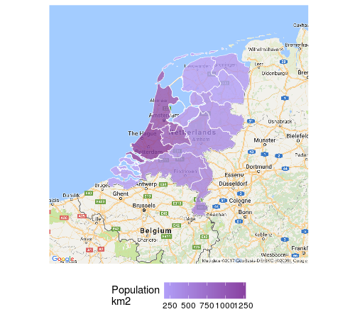
For the maximum wow factor we’re going to combine the Google map of The Netherlands with the raster plot. To get the Google map of the Netherlands the ggmap library is used:
map_nld <- get_map(location = "netherlands",
                   zoom = 7,
                   maptype = "terrain",
                   source = "google",
                   color = "color")
Then the ggmap is combined with the filled raster plot to get this:
ggmap(map_nld) +
  geom_path(data = fnetherlands, aes(x = long, y = lat, group = group), alpha = 0) +
  geom_polygon(data = tbl_province,
               aes(x = long, y = lat, group = group, fill = qty_population_km2), alpha = 0.7) +
  geom_path(data = fprovinces,
            aes(x = long, y = lat, group = group), size = .2) +
  scale_fill_continuous(low = "#8FC4FF", high = "#483D7A", na.value = NA)
Note how the original ggplot function is replaced by a ggmap function. The data and aesthetics then were moved to all the functions plotting the raster data. It is important to repeat the group aesthetic on all layers, since it does not propogate from the main aesthetic, previously set in the ggplot function. If you don’t do this, your map looks more like a broken vase then a map.
World map
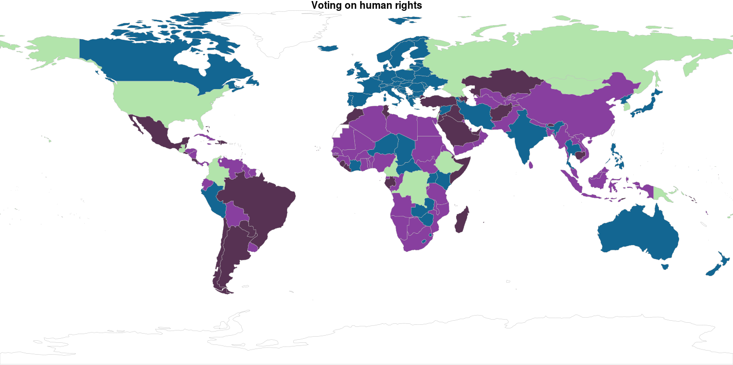
The library rworldmap lets’ you easily plot statistics in world maps as long as you van ISO coded country codes in your data set. Below we load the library, and ‘join’ the data frame df_country_votes with the pam_cluster variable and the ISO2 coded country_code variable to our world map:
mapped_data <- joinCountryData2Map(df_country_votes,
                                   joinCode = "ISO2",
                                   nameJoinColumn = "country_code",
                                   suggestForFailedCodes = TRUE)
The palette cbbPalette is created to fill our colors on the world map. The mapCountryData function is called supplying the data set mapped_data you’ve just created. The string pam_cluster is passed to the nameColumnToPlot parameter to make the colors match up with the cluster. Note that the colourPalette parameter gets the slightly weird subset of the cbbPalette colors by using the argument cbbPalette[1:4]; this is done so the numbers of colors in the palette matches the number of values in the dataset; otherwise the colors will be interpolated, which could give you results you’re not quite happy with.
cbbPalette <- c("#000000", "#E69F00", "#56B4E9", "#009E73", "#F0E442", "#0072B2")

par(mai=c(0,0,0.2,0),xaxs="i",yaxs="i")

mapCountryData(mapped_data,
               nameColumnToPlot = "pam_cluster",
               colourPalette = cbbPalette[1:4],
               catMethod = "categorical",
               addLegend = FALSE)
