- Extensions
- Axis formatting
- Point plots
- Bar plots
- Pie charts
- Creating your own theme
- Combining graphs
Extensions
ggplot has a lot of nice extensions: http://www.ggplot2-exts.org/gallery/ adding loads of new plots to your repertoire.
Axis formatting
ggplot axes labelling quickly end up with scientific notations… Not something I really like. You can force ggplot to display ‘normal’ numbers by adding this to your plot statement:
scale_y_continuous(labels = format_format(big.mark = ".",
                                          decimal.mark = ",",
                                          scientific = FALSE))
If you use currency in your plot you probably want the axis to represent this. If you use the function below, you can use that function when formatting an axis. You can add the function to your axis layout like this:
scale_y_continuous(label=euro_format)
Point plots
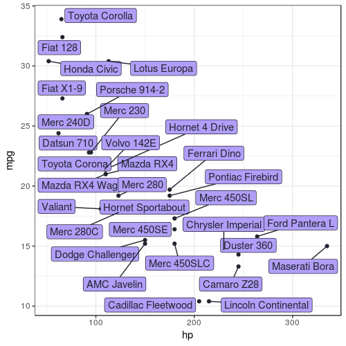
Sometimes you need labels indicating which point in the plot stands for what. Using the geom_label and geom_text functions cause overlapping so the texts become illegible. The ggrepel library provides the geom_label_repel function which prevents exactly that. It makes sure each label dodges others whenever possible.
ggplot(mtcars, aes(x = hp, y = mpg)) +
  geom_point() +
  geom_label_repel(aes(label = rownames(mtcars)))

Bar plots
The most commoly used kind of plot must be the bar plot, here are some things I had struggles with.
Percentage of rows per variable
Generally the data set we use is not aggregated, but we still want a count of the rows in it. One of the problems I came across is: how do I plot a percentage of the whole population on one bar? Bar plots where the bars represent percentage of the whole population are created with geom_bar like this:
geom_bar(aes(y = (..count..)/sum(..count..)))
To show the percentage labels within the stacked bar, the geom_label function must have it’s own y aesthetic so they are well alligned. The percentage value perc is a value between 0 and 1, but is displayed like a proper percentage by passing it to the percentage function from the scales library.
geom_label(aes(y = cumsum(perc) - perc / 2, label = percent(perc)))
Dodged bar plots with value labels
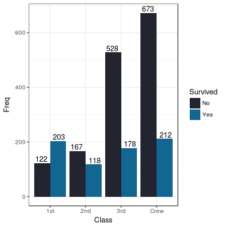
Whenever I wanted value labels on side by side bar-plots I got a headache: how do you make sure the texts are dodged as well? Below I’ve made an example based on the Titanic data set. I had to convert it to a data frame before I could use it in a ggplot. The trick of the text dodgingg is in the setting the position parameter of the geom_text function to position_dodge(width = 1). The vjust parameter let’s you play around with the text’s position around it’s y aesthetic; setting it’s value to -.25 puts the text above the bar, while setting it to 1.5 puts it on the inside end of the bar.
titanic <- as.data.frame(Titanic)

titanic %>%
  group_by(Class, Survived) %>%
  summarise(Freq = sum(Freq)) %>%
ggplot(aes(x = Class, y = Freq, fill = Survived)) +
  geom_col(position = "dodge") +
  geom_text(aes(label = Freq),
            position = position_dodge(width = 1), vjust = -0.25)

Stacked bar plots with value labels
This trick works te same as explained for the dodged bar plots, but the value of the position argument in the geom_text function is determined by the function position_stack instead of the position_dodge function. The geom_text function would now look like this:
position = position_stack(vjust = 0.5)
The vjust value will place the text in the middle of each partial bar.
Pie charts
Creating a pie chart is not a straightforward process in the ggplot framework, since Tufte deemed them bad, they aren’t worth proper attention. Standard parts of a ggplot are axes, which aren’t usefull for pie charts. So to display pie charts cleanly we need to create an ‘Empty’ theme:
blank_theme <- theme_minimal()+
  theme(
    axis.title.x = element_blank(),
    axis.title.y = element_blank(),
    axis.text =  element_blank(),
    panel.border = element_blank(),
    panel.grid=element_blank(),
    axis.ticks = element_blank(),
    plot.title=element_text(size=14, face="bold")
  )
Let’s make and example of the diamonds data set. The coord_polar function in this code is what turns a bar plot into a pie chart.
- First the diamond data set is prepared by aggerating it by cut and counting the rows, then the percentage, perc is calculated. The cut variable and perc are put together in a label seperated by a newline
rmutate(label = paste0(cut, "\n", percent(perc))); this label will be used to display on top of the bar char. The data frame is descendingly ordered by the percentage so the labels will correctly align to the plot. The data is fed into the ggplot function. - The geom_col function aesthetic’s color fill is done by cut, but the order is determined by the percentage by
r reorder(cut, perc). The parameter width is set to 1 so the pie chart has no hole in the middle. - For adding the labels the geom_label’s x is set to 1.2 to ensure the label is put somewhat on the outside of the plot. The col aesthetic, like the fill of the geom_col is ordered by the perc variable so the colors line up.
- The coord_polar function turns the bar chart into a pie chart by setting the theta to “y” so the y-axis is the circumference of the pie.
- I’ve turned off the fill and color legends, using the guides function, since all information is displayed in the labels
- Lastly the newly created blank_theme is added to remove all the bloat.
diamonds %>%
group_by(cut) %>%
summarise(n = n()) %>%
mutate(perc = n / sum(n)) %>%
mutate(label = paste0(cut, "\n", percent(perc))) %>%
arrange(desc(perc)) %>%
ggplot(aes(x = "", y = perc)) +
  geom_col(aes(fill = reorder(cut, perc)),
           width = 1,
           col = "white") +
  geom_label(x = 1.2,
             aes(y = cumsum(perc) - perc / 2,
                 label = label,
                 col = reorder(cut, perc)),
             size = 5) +
  coord_polar(theta = "y", start = 0) +
  guides(col = FALSE, fill = FALSE) +
  blank_theme

Creating your own theme
Sooner or later you want to standardize your lay-out of the graphs: all graphs should use the same set of colours, all graphs should have this turned on, that turned off, this made more dark etcetera. I do this by first choosing one of the standard themes from the ggtheme library and tweaking that. In this case
To add your own color the you simply create your own vector of hexadecimal color codes. If you don’t have a set you can generate one using a picture by using the site canva or similar sites.
col_theme <- c("#483D7A", "#8FC4FF", "#1B4229", "#7B6C5B", "#9A5F89")
You can use this vector in the scale_color_manual and scale_fill_manual functions to use it there for the color and fill of your graphs aesthetics:
scale_color_manual(values = col_theme) +
scale_fill_manual(values = col_theme)
Combining graphs
Sometimes you want two ggplots together in one picture, by putting them side by side or in a matrix of graphs. You can do this using the gridExtra library. In this example I was putting two plots p_miss_vars and p_miss_pattern side by side:
grid.arrange(p_miss_vars, p_miss_pattern, nrow = 1)