 Whenever I’m in an explorative phase of my data modelling, very soon I’ll have questions about the data that may sound familiar in its vagueness:
- Can I find any groups in this list of people by how much money they spent on drugstore items, minutes they’ve spent in greeneries department and the amount of time they spent in the gym?
- Are there any groups of customers that stand out in money spent, products they buy and market share we have?
- What smartphones are available in the market and how much are they alike in terms of specs and pricing? (Give me a data-set please!)
- How much do cats look alike in fluffiness of the tail, playfulness, hair color, eye color, number of legs…. I have a lot of cats…
- And the desperate: “I have no clue what I’m looking for, please give me a clue?”
The similarity between these questions is mostly captured by the generic sentence: how similar are these cases in terms of a, b c, d, e… well, you’re getting the picture… right? What you’re really looking for, are variables that can make a narrative about a set of data: maybe you find small pockets of observations that have special meanings or maybe you find variables that are group defining. These narratives can further by explored by clustering data or making predictions based on a subset of variables.
As you might have noticed, I’ve used the word similarity a lot. We can calculate similarity between observations based on variables. (You can find out more about caclulating similarities in this tutorial. This wil result in a large matrix where each observation is matched with the other. This gives us way too many variables of similarity, one for each observation, to plot in any senseful way. If you want to review similarity you can use MDS to reduce the number of similarity measures while still retaining as much of the similarity information as possible. If you use MDS to boil the similarity data down to two varaibles, it let’s you visually inspect similarity in observations in an easy 2D scatterplot. The more alike observations are the closer their points are together, the more unlike they are the further they are apart.
In this tutorial, I’ll cover the concept of MDS, and show two types of MDS calculation in R: metric and non-metric.
The concept

How do you get the set of many similarity variables down to two variabales? MDS does this by “rearranging” the observations in an efficient manner, so as to arrive at a configuration that best approximates the alikeness of observations. The MDS-like solution you are very familiar with, without even being conscious of it, is a world map. Making a flat world map, from the spherical object it is, always does some kind of ‘damage’ to the original. This video that illustrates that really well:
While the MDS algorithm tries to fit the observations in the lower dimensional space, it tries to keep a measure called stress as low as possible. The stress measure compares the distances of the original n-dimensional space (n = each variables distance measure) to the newly created distances in the lower dimensional space. The higher this distance between original points and new points are, the higher the stress, the worse the MDS solution is. The MDS algorithm moves the observations around until the configuration is is the solution with the lowest stress.
Choosing the type of MDS
Any MDS algorithm you’ll be using takes in a similarity matrix. (If you want to read up on that I’ve written a tutorial about that subject. Based on measurement level of the variables you use to create your distance matrix determines the choice of the type of MDS you’ll be using: either parametric and non-parametric MDS. If you have created the distance matrix based on interval or ratio measurement level variables you can make a metric MDS solution based on that. If you have created the distance matrix based on categorical you can create a non-metric MDS solution. Ordinal and mixed based distance matrices could go either way, but mostly will be best non-metric MDS solutions.
Metric MDS
 You can perform metric MDS, or classical MDS as it’s also called, using the cmdscale function which is included in the base R package, so you won’t need to install a package for this one.
The data set we’ll be using for our example on metric MDS is a data set about crime rates in cities of the USA from 1973. It contains variables about violent crime rates per 100.000 residents for assault, murder, and rape. I’ve used this example before in the Similarity tutorial, which you could read up on, for more on similarity and distances.
First a distance object is created from scaled data, which is needed to ‘feed’ the cmdcale function:
scaled_USArrests <- scale(USArrests)
dist_USArrests <- dist(scaled_USArrests, method = "euclidian")
Now we convert the distance object to a normal matrix which can be used by the cmdscale function.
mat_USArrests <- as.matrix(dist_USArrests)

mds_USArrests <- cmdscale(mat_USArrests, eig = TRUE, k = 2)  # Perform the actual MDS
Then we combine the data set with the MDS solution to a data frame we can use for our plot:
df_mds_USArrests <- data.frame(city = row.names(USArrests),
                               scaled_USArrests,
                               x = mds_USArrests$points[,1],
                               y = mds_USArrests$points[,2])
Since we want to see how all variables impacted the MDS solution we’ll rotate the variables so we can look at the solution by making a plot for each variable, through ggplot’s facet function.
df_mds_USArrests %<>%
  gather(key = "variable", value = "values", -city, -x, -y)
Then we can finally create the plot. Note how the values variable are used to control point color and opacity and how the variables variable is used in the facet function. They are used together we can get a look at the impact of all variables on similarity. I’ve used the ggrepel library for it’s geom_label_repel function to create the non-overlapping labels.
ggplot(df_mds_USArrests, aes(x, y)) +
  geom_jitter(aes(col = values, alpha = values)) +
  geom_label_repel(aes(label = city, fill = values, alpha = values)) +
  facet_wrap(~variable)
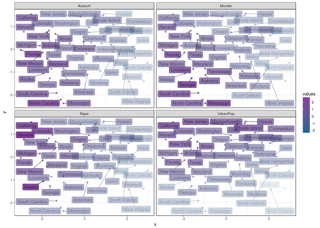
This creates the plot below, where the cities are plotted by similarity and their respective crime rates and population are indicated by their opacity, depending on which facet you look at. We can see here is that the distances across the X axis tells us a lot about assault: the left side shows high assault rates as compared to the right. The rape and murder rates are highest in the top left and lower left corners respectively. It looks like assault is prevalent in cities where rape and murder is also prevalent, but rape and murder are not prevalent across the same cities. The y axis represents differences in urban population percentages, it seems urban population and crime rates are not necessarily related.
It seems approaching similarities in this way already told us a lot about this data set, and should give some directions on which statistical tests mightt be done to do to see if you can confirm any the semi ‘hypotheses’ just made… Carrying on…
This link will give you the entire script for a running example you can play around with yourself.
Non-metric MDS
 To perform non-metric MDS we use Kruskal’s Non-metric MDS implemented with the monoMDS function from the vegan library. Its not the only function you can do Kruskal’s Non-metric MDS with, but it is the fastest performing one
(You can also choose the metaMDS from the vegan library or the isoMDS from the MASS library. If you use the MASS library, dplyr’s select function will be overruled, which is annoying. You can reset the select function back to the dplyr function with select <- dplyr::select)
To show how this procedure can be done in R, I’ve found a movie dataset here, which contains numerical variables like rating and number of votes, as well as categorical values about the movie’s genre. Since this set is an example of variables with mixed types of measurement levels (categorical genre data, and interval data like rating) we’ll be using Gower’s General Similarity Coefficient to calculate similarity. Calculating Gower’s distance is explained further in the Similarity tutorial.
Calculating the Gower distance matrix in R can be done with the daisy function from the cluster package. Before we jump into the code, a short explanation about the data: the data frame df_movie_selection contains all relevant data for the similarity calculation, but the first column contains the film title, which would nog make much sense to put into the similarity object:
library(cluster)
dist_gower <- daisy(df_movie_selection[, -1],
                    metric = "gower",
                    type = list(logratio = 3))
The distance object is that converted into a regular matrix, which can feed into the MDS function:
mat_gower <- as.matrix(dist_gower)
So let’s create the nonmetric MDS solution with the monoMDS function:
mds_nonmetric <- monoMDS(dist_gower)
Then a data frame is created so the MDS solution can be plotted with ggplot:
df_mds_nonmetric <- cbind(df_movie_selection,
                       x = mds_nonmetric$points[,1],
                       y = mds_nonmetric$points[,2])
Also we can review the movies if they fit multiple genres. For this purpose a variable, genre, is created where the genre(s) a movie belong to is put in a string:
df_mds_nonmetric %<>%
  mutate(genre = paste0(ifelse(Animation == 1, "Animation, ", ""),
                        ifelse(Comedy == 1, "Comedy, ", ""),
                        ifelse(Drama == 1, "Drama, ", ""),
                        ifelse(Documentary == 1, "Documentary, ", ""),
                        ifelse(Romance == 1, "Romance, ", ""),
                        ifelse(Short == 1, "Short, ", ""))) %>%
  mutate(genre = substr(genre, 1, nchar(genre) - 2)) %>%
  mutate(genre = factor(genre))
It would be great to have the genres displayed in a text label, but if we give each point in the plot a text label we’ll end up with too many text labels. To counter that problem we create one point, at the median of x and y of each genre, with a text label containing the genre. By taking the median of the x and y values per genre combination, it is likelily the position of that label represents the majority of points.
df_genres <- df_mds_nonmetric %>%
  group_by(genre, Animation, Comedy, Drama, Documentary, Romance, Short) %>%
  summarise(x = median(x),
            y = median(y))
Finally we can create a plot with the MDS solution. I’ve used the ggrepel library for it’s geom_label_repel function to create the non-overlapping labels. Note how the geom_label_repel layer uses the df_genres as data, instead of the movies themselves:
ggplot(df_mds_nonmetric, aes(x, y)) +
  geom_label_repel(data = df_genres,
                   aes(x, y, label = genre, col = genre)) +
  geom_jitter(aes(col = genre), alpha = .2)
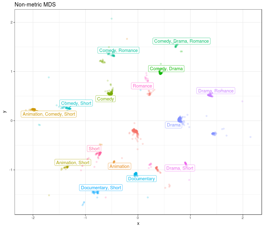
We can see there is a nice continuity between the different genres, and there is a non-genre cluster in the middle. It is intruguing how some of the non-genre movies are between the Documentary and Drama, Short genres. Another non-genre cluster is close to the Romance genre. The MDS solution is dominated by the genres.
Let’s be stubborn
Now, let’s see if the metric MDS solution would be worse in this mixed measurement level case. For this we first create a metric MDS solution with the cmdscale function:
mds_metric <- cmdscale(dist_gower)
Then we do all the steps as with the non-metric MDS solution, to create a data-freame with wich we can create the metric MDS solution plot. I’ll skip those steps here, as they are the same as described before, but the whole script is downloadable from here if you want to review it.
ggplot(df_mds_metric, aes(x, y)) +
  geom_label_repel(data = df_genre_metric,
                   aes(x, y, label = genre, col = genre)) +
  geom_jitter(aes(col = genre), alpha = .2)
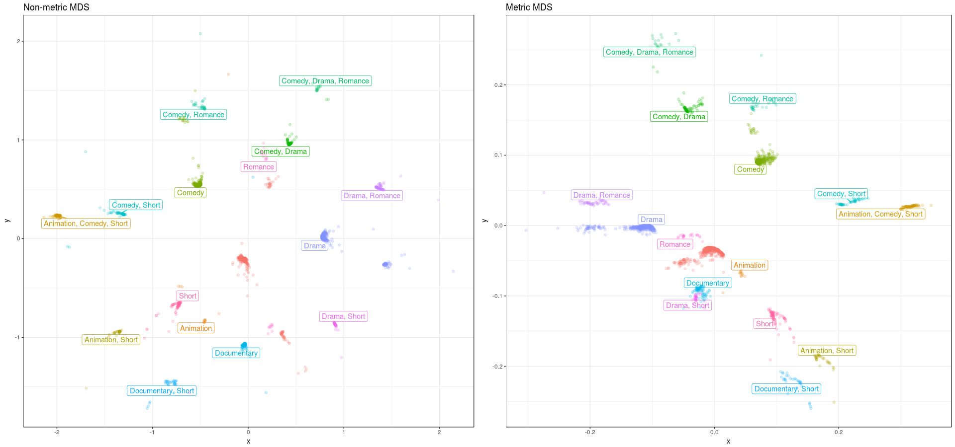
Let’s compare the non-metric versus the metric MDS solution. We can see that the metric solution a ‘chasm’ between two sets, while the non-metric option looks more like a sphere. If you compare the continuity between the “Drama, Romance” and the “Comedy, Drama, Romance” genres, the non-metric version seems more logical than the metric version, which seems to make sense. So doing a non-metric MDS for non interval data, does get you a more optimal MDS solution.
You can get he whole scripts for performing this non-metric MDS from here
• 0 Comments