 As a kid I was captivated by the strange world of Disney’s Alice in Wonderland: nothing seemed to make sense and everything was wonderfully weird and exciting. When I read the ‘real’ book as an adult, I found out what also gave its appeal to a kids mind: the strange context with questions are being asked in Alice will make you wonder off…
I decided it was time to learn some text mining and learned about the gutenbergr library. This library allows you to scrape information about writers, books and even the books itself from the project Gutenberg. And since Alice was on there, it was a no-brainer to have Alice’s Adventures in Wonderland as a trial. What I wanted to know: how are the characters in Alice’s world perceived? In text mining terms: what are the sentiments associated with the characters? To explore this I’ve written a script that can be downloaded here
For this tutorial I’ve assumed that you’re pretty familiar with the tidyverse and ggplot2. First I’ll discuss the concepts that drove the script, after which I’ll jump into the technical workout of these concepts. The final script can be found in a link at the end of the tutorial.
The building blocks
Sentiments
Two of the most important datasets that are part of the tidytext package are the stop_words and sentiments. The first is useful when removing common words like prepositions and conjuctions. The other - sentiments - is useful for us to determine the emotions associated with the characters. The sentiment dataset contains 4 columns:
- lexicon - the dataset contains several lexicons, each having their own characteristic way of representing sentiments:
- nrc - This is the lexicon we’ll be using. It associates words with 8 basic emotions. These sentiments are found in the sentiment column.
- bing - This lexicon divides words in either having negative or positive connotations. Which of it is can be found in the sentiment column.
- AFINN - This lexicon also divides words in negative or positive connotations, but takes a scale approach inste ad of the bing binary approach.
- word - you use this column to join the dataset with
- sentiment - Depending on the lexicon you’re using this is filled with descriptions.
- score - if you use the AFINN lexicon this column contains the numerical value.
The nrc dataset I’ll be using attributes one or more sentiments per word, which makes sense: words can evoke several emotions depending on context. I assume the ‘right’ sentiments will bubble up by the surrounding word sentiments.
Characters
 This one speaks for itself. A vector of characters is what was needed, and I saw little options that just type all. Typing stuff like that makes me understand the Queen of Hearts….
Paragraphs
The paragraphs are the thing that tie the sentiments to the characters. I assumed that the sentiments that co-appear in the paragraph with characters, tells us something about the character. The sentiment profile then, is partly determined by the relative frequencies in which the sentiments co-appear with a character in paragraphs. Relative frequencies are calculated like this:
![]()
Relative frequencies in itself are not good enough because the book is probably scewed in a certain sentimental direction, which does not help if we want to know what makes a character unique. To counter this I use something I called lift: the relative sentiment frequency of a character, corrected by the relative frequency of the total. As the total I’ve taken Alice’s relative sentiment frequencies. So the lift was calculated like this:
![]()
Luckily the ebook had white lines to delimit the paragraphs; sometimes life is easy.
Plutchik’s wheel
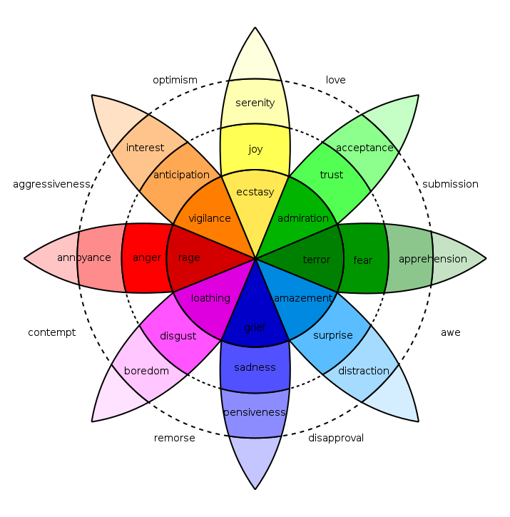 Remember the lexicons? I don’t know whether this is coicidence, but the sentiment terms used in the nrc lexicon fit surprisingly well with Plutchik’s wheel of emotions. As it is such a nice fit, I thought I’d use it as the basis of my plots.
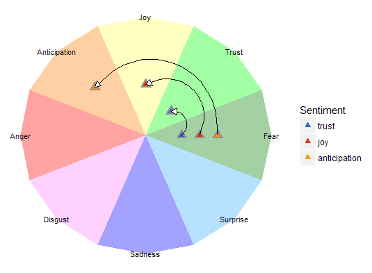
As a psychologist, my first thought was: spider-graphs; create a character profile by plotting the value sentiment confidence of a character on each of the emotion scales and connect the dots. To do this I put the confidence value on the x axis, and rotated it to the corresponding emotion petal to find out the x and y coordinates of that sentiment value. For example
If you’ve seen spider-graphs a few times you know they can be very confusing when comparing multiple profiles: after more then 3 profiles spider-graphs become virtually unreadable. So I’d thought I’d dumb them down a bit by only displaying the center of gravity of each spider graph.
The script
Drawing Plutchik’s wheel
For this I’ll be using the ggplot2 library’s geom_polygon_layer . With ggplot2 you can combine seperate ggplots by adding them. Thinking I might need the Plutchik plot again I put it in a function that does the drawing; the function takes the wheels radius as a parameter. I made the wheel’s radius variable to ensure the characters plotted in the wheel are optimally displayed.
plutchik_wheel <- function(radius)
A vector is created with the hex colors codes that are used to color the Plutchik’s wheel.
plutchik_colors <- c( "#8cff8c", "#ffffb1", "#ffc48c", "#ff8c8c",
                      "#ffc6ff", "#8c8cff", "#a5dbff", "#8cc68c")
Plutchik’s wheel has 8 spokes, which I’ll refer to as petals. My approach to drawing the wheel is drawing each petal and then rotating it to the position corresponding to the sentiment.
To create a closed polygon for each petal, 5 points draw a petal: one from the origin (0, 0), three points on the perimeter of the wheel, and one again at the origin to close the polygon. The points at the perimeter of the wheel are part of the total wheel. So to calculate these points we take the radius of the circle, and rotate them by 22.5 degrees (360 degreed / (8 petals * petal edges)). First we create a vector with the rotations needed for one petal:
petal <- rep(c(0, 1:3, 0) ,8)
This would repeat the same petal over and over again on the same place, but instead we want the petals drawn next to each other. For this we’ll transpose the petal vector so that each petal will have its own unique position:
petal_transpose <- rep(c(0, 2, 2, 2, 0), 8) * rep(c(0:7), each =5)
petal_transposed <- (petal + petal_transpose)
Now the transposed petals are converted to radians to calculate the petal coordinates at the next step.
radian_petals <- petal_transposed * 22.5 * pi/180
Now we create two vectors for the coordinates; x and y:
x <- radius * (petal > 0) * cos(radian_petals)
y <- radius * sin(radian_petals)
Then we create a vector for grouping the other vectors by petal, with this we’ll be able to color the individual petals.
id <- as.factor(rep(c(1:8), each = 5))
Now we’ve got all ingredients for drawing the petals. Next a factored vector is created with the petal names, with the names positions so they show up in the middle of the perimeter. All other positions in the vector have NA as a value so no text will be displayed, this will generate a warning message that 32 values are removed that contain missing values (geom_text).
emotions <- factor(c( NA, NA, "Trust", NA, NA,
                      NA, NA, "Joy", NA, NA,
                      NA, NA, "Anticipation", NA, NA,
                      NA, NA, "Anger", NA, NA,
                      NA, NA, "Disgust", NA, NA,
                      NA, NA, "Sadness", NA, NA,
                      NA, NA, "Surprise", NA, NA,
                      NA, NA, "Fear", NA, NA ),
                    levels = c("Trust", "Joy", "Anticipation", "Anger",
                               "Disgust", "Sadness", "Surprise","Fear"),
                    ordered = TRUE)
All the vectors are combined in one data frame that can be used in a ggplot.
tbl_plutchik_wheel <- data.frame(id, x, y, emotions)
Lastly a ggplot is created, which can later be used as part of the final plot stack. The custom ggplot theme removes all unnecesary clutter (grids, ticks and titles of the axes and the legend of the colors in the wheel).
wheel <- ggplot() +
  geom_polygon(data = tbl_plutchik_wheel, aes(x, y, fill=id, group=id)) +
  geom_text(data = tbl_plutchik_wheel, aes(x, y, label = emotions)) +
  scale_fill_manual(values = plutchik_colors) +
  theme(axis.line = element_blank(),
        axis.text.x = element_blank(),
        axis.text.y = element_blank(),
        axis.ticks = element_blank(),
        axis.title.x = element_blank(),
        axis.title.y = element_blank(),
        legend.position = "none",
        panel.background = element_rect(fill = "white"))
Getting the book
To retrieve Alice’s Adventures in Wonderland we first need to load the gutenbergr library.
library(gutenbergr)
You can retreive the book by using the _gutenberg_download _function and passing the book ID as a parameter. The ID of Alice’s Adventures in Wonderland is 11. The ID of the ebook is the last number of the URL when browsing for the book on the Project Gutenberg website.
book_alice <- gutenberg_download(11)
Detecting the paragraphs
Besides using the tidyverse library for this tutorial, we’re going to use two additional libraries:
- tidytext - this library brings the tidyverse and text mining together. It allows you to make tidy data-frames to pass on to text mining tools.
- stringr - a library packed with functions for text manipulation.
So let’s start by loading the necessary libraries:
library(tidyverse)
library(tidytext)
library(stringr)
In the next section we take the downloaded book and add some line numbers to it first. We use these line numbers to skip some irrelevant lines of the book containing the title and such. After which we find out which rows are just chapter headings, and then we count the words in each line. We mark the lines which don’t contain a chapter header and which have words as paragraphs.
tbl_paragraphs >- book_alice %>%
  mutate(line = row_number()) %>%
  filter(line >= 10 & line < 3338) %>% # Skipping irrelevant lines
  mutate(is_chapter_title = str_detect(text, "CHAPTER")) %>%
  mutate(qty_words = sapply(gregexpr("[[:alpha:]]+", text), function(x) sum(x >; 0))) %>%
  mutate(is_paragraph = !is_chapter_title & qty_words > 0)
After this the rle function is used to find consecutive rows belong to a paragraph and when it is broken by non-paragraph lines. Each row in resulting data-frame tells us how many lines are part of one paragraph, or the number of lines between paragraphs.
 tbl_paragraph_id <- data.frame(length = rle(tbl_paragraphs$is_paragraph)[[1]],
                                value = rle(tbl_paragraphs$is_paragraph)[[2]])
The we use this data frame to create a new column in the paragraph data frame to set an identifier for each paragraph. With the function seq a number is generated for each set of consecutive lines. The rep function repeats this number for the number of consecutive lines. In the next mutate function the paragraph identifiers are removed if the set of consecutive rows are not part of a paragraph.
tbl_paragraphs %<>% mutate(id_paragraph = rep(seq(1,nrow(tbl_paragraph_id),1),
                                              tbl_paragraph_id$length)) %>%
  mutate(id_paragraph = ifelse(is_paragraph, id_paragraph, NA))
Next we’ll un-nest all words in each line so each word will become one row and put it in the tbl_words data frame. We use the function anti_join to remove any of the stopwords. Then only “words” are kept that only consist of letters. After this we only keep the words, the paragraph identifier in which they appear, and the frequency of their usage in that paragraph.
tbl_word <- tbl_paragraphs %>%
  unnest_tokens(word, text) %>%
  anti_join(stop_words, by = "word") %>%
  mutate(word = str_extract(word, "[a-z']+")) %>%
  group_by(id_paragraph, word) %>%
  summarise(qty_word = n())
Creating a word cloud
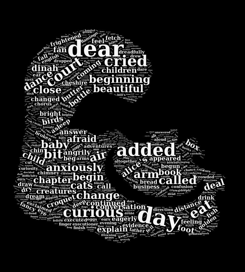
Now that we can count all words, a word cloud can be created. For this example I use the fancier option of using the wordcloud2 package. With this package you have extensive control on how your wordcloud can look. One of the options I’ve used here is using a transparent version of a silhouette of the Cheshire cat. I used this statement to create the wordcloud
wordcloud2(data.frame(tbl_word_freq),
           figPath = "cheshire-cat.png",
           size = 1,
           color = "whitesmoke",
           backgroundColor = "black")
Finding sentiments
We’ll use the sentiments data frame from the tidytext package to create a custom data frame. But before we do that we’ll create our own data frame that specifies how many degrees each sentiment should be rotated to fit it on Plutchik’s wheel. The sentiments are then factored ordered by their order in Plutchik’s wheel.
sentiment_order <- c("fear", "trust", "joy", "anticipation",
                     "anger", "disgust", "sadness", "surprise")
degrees_sentiment <- c(0, 45, 90, 135, 180, 225, 270, 315)
tbl_sentiments <- data.frame(sentiment_order, degrees_sentiment)

tbl_sentiments %<>%
  rename(sentiment = sentiment_order) %>%
  mutate(sentiment = factor(sentiment, levels = sentiment_order, ordered = TRUE))

rm(degrees_sentiment)
The custom data frame, tbl_sentiments, that we’ll create here just uses the nrc lexicon, and leaves out the ‘positive’ and ‘negative’ sentiments; which don’t make much sense in the wheel. We’ll just take the columns of that data frame which are useful to our analysis: words and their sentiments. The sentiments, which are factored variables in the original dataset, are refactored using the order in which they appear in Plutchik’s wheel; before they can be refactored they have to be converted to strings to remove previous factoring.
tbl_sentiment_lexicon <- sentiments %>%
  filter(sentiment != "negative" & sentiment != "positive") %>%
  filter(lexicon == "nrc") %>% select(word, sentiment) %>%
  mutate(sentiment = as.character(sentiment)) %>%
  mutate(sentiment = factor(sentiment, levels = sentiment_order, ordered = TRUE))
This pepared data frame tbl_sentiment_lexicon is used together with the tbl_word data frame to tie the sentiments to paragraphs. The sentiments are grouped by paragraph and their frequency is counted.
tbl_par_sentiments <- tbl_words %>%
  inner_join(tbl_sentiment_lexicon, by = "word") %>%
  group_by(id_paragraph, sentiment) %>%
  summarise(qty_sentiment = n())
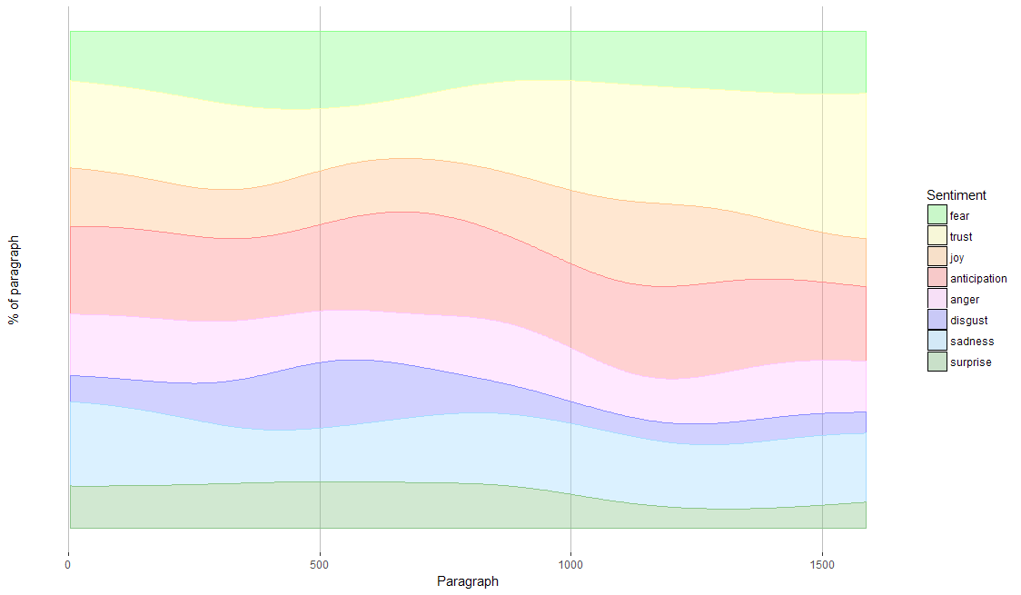
When we look at the occurence of sentiments throughout the book, we see that surprise and fear make place for trust. The idea that Alice will get more used to the absurdities of Wonderland the longer she stays there does make sense.
Finding characters
To find the appearance of the characters in paragraphs the manually filled vector personea is used with the tbl_word data frame. Only the words that match the personea are kept. These are then grouped by paragraph, and their occurence in the paragraphs is counted.
tbl_par_personea <- tbl_words %>%
  mutate(is_person = word %in% personea) %>%
  filter(is_person) %>%
  select(id_paragraph, persona = word, qty_word) %>%
  group_by(id_paragraph, persona) %>%
  summarise(qty_mentions = sum(qty_word))
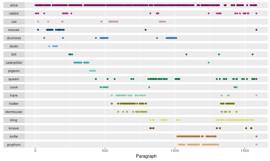
The plot below shows when the characters appearance throut the book. As you can see how Alice, unsurprisingly, plays a big role throughout the book.
Combining persons and sentiments
To find out what sentiments are associated with each character the two data frames we just created, tbl_par_personea and tbl_par_sentiments, are joined to find out which sentiments are associated with characters. But before we do the join the total number of mentions of a character in the book are counted without creating an intermediary table. This is achieved by using the mutate function instead of the usual summarise function after calling the group_by function. After the sentiments are matched with the characters by paragraphs, the number of sentiment occurrences are summed per character-sentiment combinations. After this the ungroup function is called to be able to do further grouping. The total sum of sentiment occurences per character is summed to calculate the relative frequency of sentiments. To ensure all sentiments are represented for each character we add all missing sentiments with the great complete function. The first argument in this function specifies which group we want to complete (the characters), then we specify which unique values we want to create when missing by using the sentiment variable within the nesting function. In the fill parameter we specify the values we want to give to the variables when the new sentiments are added.
tbl_persona_sentiments <- tbl_par_personea %>%
  group_by(persona) %>%
  mutate(qty_paragraphs = n_distinct(id_paragraph)) %>%
  inner_join(tbl_par_sentiments, by ="id_paragraph") %>%
  group_by(persona, sentiment, qty_paragraphs) %>%
  summarise(qty_sentiments = sum(qty_sentiment)) %>%
  ungroup() %>%
  group_by(persona) %>%
  mutate(qty_sentiment_persona = sum(qty_sentiments)) %>%
  ungroup() %>%
  mutate(perc_sentiments = qty_sentiments/qty_sentiment_persona) %>%
  complete(persona, nesting(sentiment), fill = list(qty_sentiments = 0,
                                                    qty_paragraphs = 0,
                                                    qty_sentiment_persona = 0,
                                                    perc_sentiments = 0))
The characters that appear very few times in the book run the risk of having sentiment profiles that are out of whack. They are filtered out:
tbl_persona_significant <- tbl_persona_sentiments %>%
  group_by(persona) %>%
  summarise(qty_sentiments = sum(qty_sentiments)) %>%
  filter(qty_sentiments > 35)

tbl_persona_sentiments %<>%
  filter(persona %in% tbl_persona_significant$persona)
A character’s sentiment profile
To determine the uniqueness of the sentiment profile we use the lift measure; we will measure how much each sentiment for a character is over- or underrepresented in comparison to Alice. So we first put the relative sentiment frequencies of Alice in the data frame tbl_alice_sentiments to join them with the sentiments of all characters. Based on the sentiment lift we also calculate another measure, which I’ll call impact, that shows how much the sentiment deviates from Alice’s profile, irrespective whether it’s over or underrepresented. This measure will later be used in the visualisation.
tbl_alice_sentiments <- tbl_persona_sentiments %>%
  filter(persona == "alice") %>%
  select(sentiment, perc_alice = perc_sentiments)

tbl_persona_sentiments %<>%
  inner_join(tbl_alice_sentiments, by = "sentiment") %>%
  mutate(lift_sentiment = perc_sentiments / perc_alice) %>%
  mutate(impact = abs(lift_sentiment - 1))
Now we can read all the seperate character profiles and compare them, but where is Plutchik’s wheel? To achieve this we’re just going to do a bit more.
Building the graph
To draw the sentiment lift on Plutchik’s wheel we have to rotate the lift values like we did in drawing the wheel itself for the plutchik_wheel function. Now we have the outer limit on the center of each petal, we also have to get the points of the border of each petal. For that we repeat the previous data frame three times and combine then in one data frame:
- For the left hand border we rotate the value 22.5 degrees counter-clockwise.
- One for the center we keep it as is.
- And for the right hand border we rotate the value 22.5 degrees clockwise.
tbl_sentiment_outline <- rbind(tbl_sentiments %>%
                                 mutate(degrees_sentiment = degrees_sentiment - 22.5),
                               tbl_sentiments,
                               tbl_sentiments %>%
                                 mutate(degrees_sentiment = degrees_sentiment + 22.5))
Then we calculate the coordinates for all of the petal points for the sentiment base (which is always 1) and the sentiment lift.
tbl_sentiment_petal <- tbl_persona_sentiments %>%
  inner_join(tbl_sentiment_outline, by = "sentiment") %>%
  mutate(x_base = cos(degrees_sentiment * pi/180),
         y_base = sin(degrees_sentiment * pi/180),
         x_lift = lift_sentiment * cos(degrees_sentiment * pi/180),
         y_lift = lift_sentiment * sin(degrees_sentiment * pi/180))
The geom_polygon is pretty picky about point order; it somehow has trouble mind-reading what I want. We need to order the points correctly so the function knows how to close the polygon and fill it. For this we refill the data-frame by taking the original frame, but putting in the lift coordinates in first, and then closing the polygon with the base-line (the 1’s). For ordering puroposes for each of the sets a variable is created called point_order, and for both the degrees_sentiments are used. 45 is added to the degrees_sentiments to prevent negate point_order values. When polygons, the lift points are ordered to guide the polygon-outline forward and the base are ordered backward (hence the -1 *) close the polygon.
tbl_sentiment_petal <- rbind(tbl_sentiment_petal %>%
                               mutate(point_order = degrees_sentiment + 45) %>%
                               select(persona, sentiment, point_order, impact,
                                      x = x_lift, y = y_lift),
                             tbl_sentiment_petal %>%
                               mutate(point_order = -1 * (degrees_sentiment + 45)) %>%
                               select(persona, sentiment, point_order, impact,
                                      x = x_base, y = y_base)) %>%
                       arrange(persona, sentiment, point_order)
The ggplot Pluchtick wheel function needs a radius to be drawn for an optimal size. We determine the sentiment circle’s radius each of the petal’s points distance from the origin, with the help of good old Pythagoras, and then finding the maximum petal size.
max_radius <- max(sqrt(tbl_sentiment_petal$x ^ 2 + tbl_sentiment_petal$y ^ 2))
ggplot2 allows you to stack multiple ggplots, which comes in handy in this case. We use the plutchik_wheel function which returns the ggplotted Pluchtick wheel and use it as a basis to put on a geom_polygon layer that we use to draw the profile within petals. The polygon’s line is coloured by persona. The polygon fill is gray, and it’s opacity is determined by the impact (absolute difference between base and lift).
plutchik_wheel(max_radius) +
  geom_polygon(data = tbl_sentiment_petal,
               aes(x, y, col = persona, group = sentiment, alpha = impact),
               fill = "slategrey") +
  facet_wrap(~persona, ncol = 5) +
  scale_color_manual(values = personea_colors) +
  scale_fill_manual(values = plutchik_colors) +
  guides(col = FALSE) +
  labs(list(alpha = "Impact"))
The Result
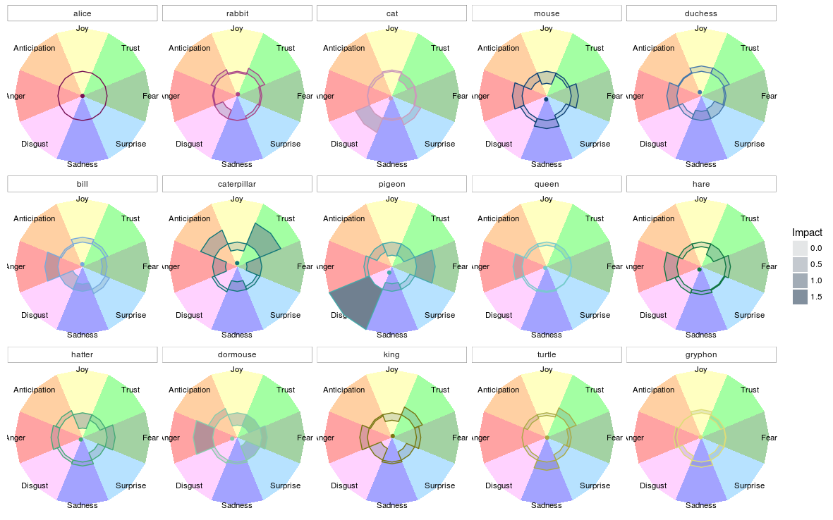
The result of the ggplot created above is this:
 Zoom
Zoom
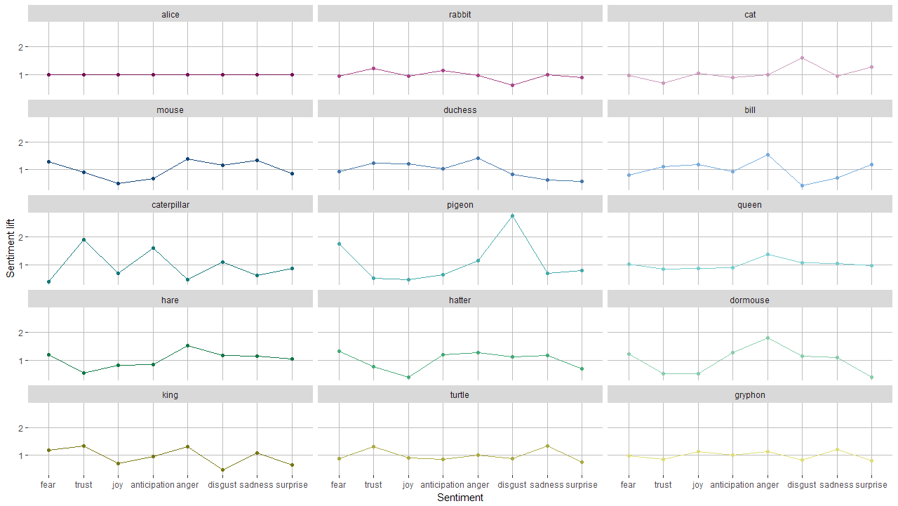
Here we can see that Alice’s profile is ‘flat’, which makes sense since she served as the base. We can see that the Rabbit is somewhat more associated with feelings of anticipation and trust, but evokes less disgust. The Cheshire cat, on the other hand, evokes plenty of disgust and surprise and is not well trusted.
And a stupid version
I’m not sharing all stupid thoughts I had creating this, but one stands out in in its simplicity and could not resist showing it. Besides that, this graph shows a technique that I found really useful: the ggrepel library. With this library you can make text labels, but unlike normal text labels, they make use of an algorithm that ensures they don’t overlap when things get crowded.
When I first thought of drawing the wheel, I thought I’d draw spider graphs on it. Then I quickly realised it would become too crowded for interpretation. Then I thought I could just as well take the center of gravity for each spider graph. After struggling to do this I finally realised you can not take a mean of the sentiments. When you look at the wheel you quickly realise that fear is not the opposite of anger, nor is surprise of anticipation and so on. None the less I’ll explain the process of making this non-sensical chart.
First we’re going to isolate person center of gravity by calculating the x and y coordinates of each sentiment lift. Then we’ll calculate the center of gravity of a spider graph by taking the mean of x coordinates and y coordinates.
tbl_person_center <- tbl_persona_sentiments %>%
  inner_join(tbl_sentiments, by = "sentiment") %>%
  mutate(x_lift = lift_sentiment * cos(degrees_sentiment * pi/180),
         y_lift = lift_sentiment * sin(degrees_sentiment * pi/180)) %>%
  group_by(persona) %>%
  summarise(x_center = mean(x_lift),
            y_center = mean(y_lift))
Determing sentiment circle radius
max_radius <- max(sqrt(tbl_person_center$x_center ^ 2 + tbl_person_center$y_center ^ 2)) * 1.2
The ggplot of profiles
plutchik_wheel(max_radius) +
  geom_point(data = tbl_person_center, aes(x = x_center, y = y_center, col = persona)) +
  geom_label_repel(data = tbl_person_center,
                   aes(x_center, y_center, label = persona),
                   alpha = 0.6,
                   fill = "white",
                   color = 'black',
                   segment.color = "black"
  ) +
  scale_color_manual(values = personea_colors) +
  guides(col = FALSE)
The total script can be downloaded from here
• 0 Comments