Principal Component Analysis (PCA) is a method for reducing a data-set with a high number of variables to a smaller set of new variables, ‘juicing’ the most of the same information out of the whole set of variables. In the data science realm it is mostly used to achieve one or more of the following goals:
- Reducing the number of variables in a dataset reduces the number of degrees of freedom of a statistical model, which in turn reduces the risk of overfitting the model.
- Machine learning algorithms perform significantly faster when less variables are included.
- It can simplify the interpretation of data, by showing which variables play the biggest role in describing the data set.
In this tutorial I’ll explain the concept behind Principal Component Analysis, and with an example I’ll show you how to perform a PCA, how to choose the principal components and how to interpret them.
How it works
PCA creates a new set of variables, based on all the old ones, in decending order of informational content. After new variables are created, the Principal Components (PCs), the ones containing most of the information are retained, while the others are discarded.
Now to explain how the PCs are created to contain most information I’ve made an example with two variables: x and y. Imagine each variable as a dimension of a space, so each observation is plotted as a point in that space. For the purpose of the explanation of the observations of the set are plotted below:
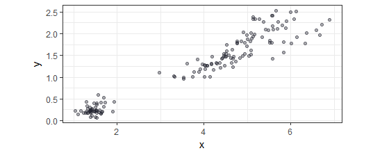
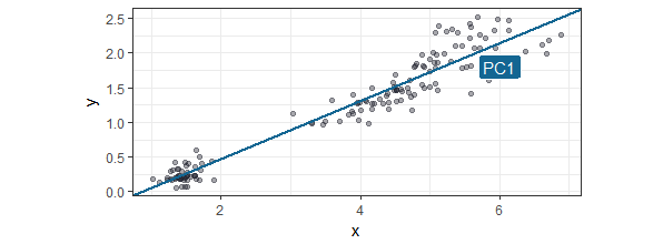
The first PC is the line is drawn so most of the observations are along this line. In most literature I found it is called the line that describes the most variance, which in my mind is the almost the same as the liniear model best describing the observations (but my mind could be wrong). It is actually done by using variance-covariance matrices and their eigenvalues and eigenvectors, but this is beyond the scope of this tutorial. If you are interested you can find the full explanation here. The first Principal Component is drawn below:
The second PC can only be put perpendicular (at a 90 degree angle) of the first PC. In this two dimensional space it only leaves one option, but in a multidimensional space you can imagine this line could be any line that rotates across the other dimensions. The second PC will be that line that again is the option with the most observations along that line. In our example the next PC is shown in the next plot:
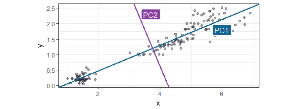
Now as we take these two PCs as the new variables instead of the old one, the new space would be rotated and look like this:
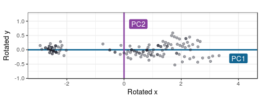
In this case, using only two variables, the PCA procedure would end here. But for more dimensions the the PCA procedure would go on for as many variables there are, so all variation in the dataset is described in the new PC variables. But since the later created PCA’s will add little information descibing the set’s variability, they can be ignored.
Of course doing a PCA on two variables has little meaning, but if we have 16, juicing all that information into less variables makes things less messy.
Our example: country religions

In our real world example I’ll take the data I’ve previously used for the clustering tutorial: the percentage of adherents per religion for all countries as it was in 2010. This example has a table in which the countries are represented in the rows, the religions in columns, and the values in those columns specifying the percentage of the countries populations that report as adhering to that religion. I won’t go into describing how the dataset is created, but if you want to, you can look it up in the script I’ve made for this tutorial.
First we’re going to create the input data for the PCA: only retaining the columns for the percentage of adherents:
pca_input_data <- df_country_by_religion[,3:16]
PCA is most succesful for data sets that display high correlations between variables. So let’s go about exploring this first by applying a Spearman Rank correlation for all variables:
library(corrplot)

mat_corr <- cor(pca_input_data,
                method = "spearman",
                use = "pairwise.complete.obs")

corrplot(mat_corr,
         order = "AOE",
         type = "lower",
         cl.pos = "b",
         sig.level = .05,
         insig = "blank")
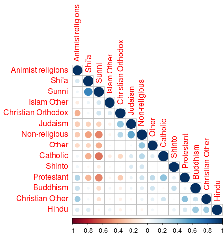
This graph shows some of the variables show pretty high correlation. This shows us the PCA will have some measure of success.
Performing PCA
Performing the PCA is pretty straightforward, the base R has two functions prcomp() and princomp(). Both do the same job, but the princomp() function can do two things that the prcomp() function doesn’t: centering next to scaling and all the observation’s PC coordinates. Since the princomp() function has these two plus points, I’ve selected this to do my PCA. The pricomp() function is described like this princomp(x, cor = FALSE, scores = TRUE). The x is the input data, the cor argument specifies whether you want to scale and center the variables. I won’t be doing scaling and centering in this case, since all variables are of comparable measures, so the default is sufficient here. If the variables were different measures like, monetary values and quantities, as is the case most of the time, the cor parameter should be set to TRUE. The observation coordinates for the PCs, scores, are automatically generated.
fit_pca <- princomp(pca_input_data)
Choose the number of Principal Components

Now all PCs are calculated we can choose which to retain. The choice of the number of PCs to be retained is done by evaluating the variance that each PC adds to the total variance of set of variables. In PCA literature you’ll see the terms ‘eigenvector’ and ‘eigenvalue’ pop-up a lot. A PC corresponds to an eigenvector, and the variance of the PC corresponds to the eigenvalue. These terms are used, because they are associated with the calculations of variance-covariance matrices used in PCA.
With the following statement we build a data-frame containing the variance for each of the PCs.
df_pca_var <- data.frame(pca = factor(names(fit_pca$sdev), levels = names(fit_pca$sdev)),
                         var = (fit_pca$sdev)^2)
Also the percentage variance of the total variance for each PC is added to the data frame:
df_pca_var %<>%
  mutate(perc_var = percent(var/sum(var)))
The data frame we’ve just created is used to generate a plot, which is often referred to as a scree plot:
ggplot(df_pca_var, aes(x = pca, y = var)) +
  geom_col() +
  geom_text(aes(label = perc_var), col = "white", hjust = 1.2) +
  coord_flip() +
  labs(x = "PCs", y = "Variance")
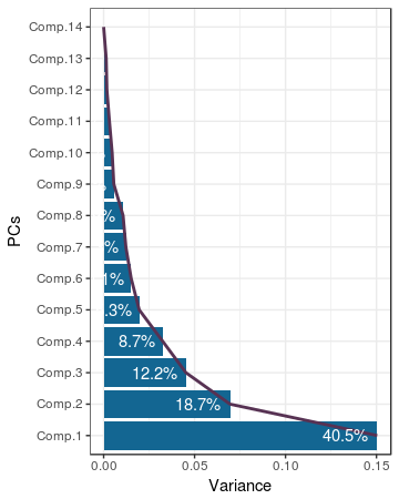
The scree plot shown above is a bit different than the normal scree plot, because it has been rotated to improve readability of the PC names. As is the custom with scree plots, the famous elbow is the thing we should be looking for when determining the correct ‘number’. In this case it is not clear cut, 5 seems to be a nice enough elbow.
no_pcs <- 5
Interpreting principal components
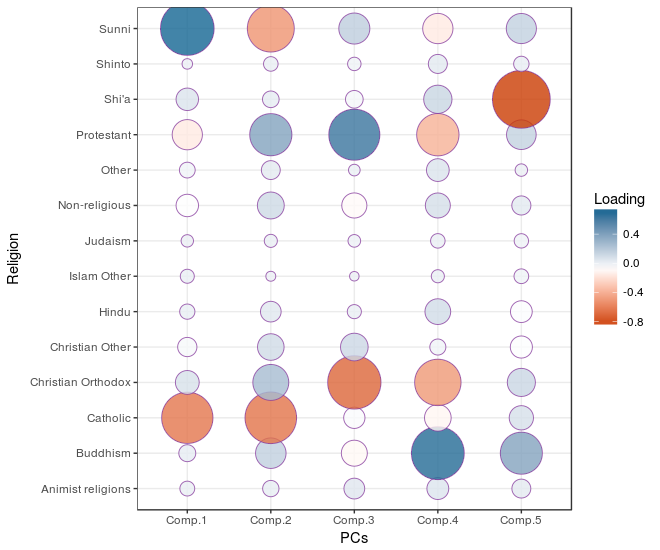
Now we need to get a sense of what the newly selected PCs represent. This can be achieved by interpreting the correlations between the chosen PCs and the original variable set. In PCA terminology thecorrelation coefficients between the variables and PCs are called loadings. First we’re going to collect the loadings data so we can calculate the correlation by putting the religion adherent variables in the rows, and the pricipal components as rows.
df_loadings <- data.frame(religion = row.names(fit_pca$loadings), fit_pca$loadings[, 1:no_pcs])
df_loadings %<>%
  gather(key = "pc", value = "loading", -religion)
This newly correlation matrix is put in a plot:
ggplot(df_loadings, aes(x = pc, y = religion, fill = loading, size = abs(loading))) +
  geom_point(shape = 21, col = alpha = 0.8) +
  scale_fill_gradientn(colors = c("red", "white", "blue")) +
  scale_size(range = c(3, 20)) +
  guides(size = FALSE) +
  labs(x = "PCs", y = "Religion", fill = "Loading")
A high value of the first PC seems to represent a high percentage of Sunni Islam adherents and low percentage of Catholocism adherents; which fits with the original correlation matrix. A high score on the second PC seems to represent a high percentage of Protestant adherents and low percentage of Catholocism and Sunni Islam adherents. After these two examples you’ll be able to figure out the rest.
Let’s see how this interpretation sticks when we take out a few examples of countries of which I have a pretty preconceived idea of how their religios adherents are distributed and see how they score on the first five PCs:
df_country_by_religion %>%
  filter(iso_alpha_3 %in% c("GRC", "NLD", "IRN", "ISR", "THA", "POL")) %>%
  select(country, Comp.1, Comp.2, Comp.3, Comp.4, Comp.5) %>%
  gather(key = pc, value = value, -country) %>%
  ggplot(aes(x = pc, y = value)) +
    geom_col(aes(fill = value)) +
    geom_text(aes(label = round(value, 2))) +
    scale_fill_gradient2() +
    facet_wrap(~country) +
    coord_flip() +
    guides(fill = FALSE)
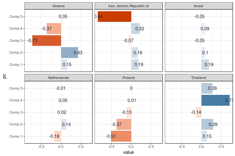
For me this plot shows no big surprises keeping in mind what the PCs represent. Greece scores very negatively on the third PC, since the third PC is negatively correlated with Christian Orthodoxy. Iran is scores very negatively on PC 5 since this one is negatively correlated to Shi’a Islam. The Netherlands has a relatively ‘flat’ religious adherency profile, which is also reflected in almost no value on the PCs as well. A strange one is Israel: Judaism is well represented there, but the PCs go flat like the Dutch PCs. As we can be seen in the correlation plot between the PCs and variables, Judaism isn’t negatively or positively correlated with any of the PCs. This is because Judaism plays such a minor role in religious distributions across the world, that it adds very little to the overall variation.
Now PCA is almost never an end in itself, so go on using it as input for your other algorithms. In this script, which contains all the code used for this tutorial, you can see how I go on using it for clustering.
• 0 Comments