Raster maps are a convenient way of plotting data in administrative districts like provinces. In this tutorial I show you how you can get a raster map, how you can use it to plot data in it, and how you can ‘prettify’ it by adding a Google map layer. The entire script for this tutorial can be downloaded from here.
The rasters can easily be retrieved using the raster library. Country maps can easily be plotted using het_getData_ function. As you might expect, the country parameter in for that function specifies the country you want to view. The country parameter should be specified using the ALPHA 3 ISO code, a list of which can be found here: http://www.nationsonline.org/oneworld/country_code_list.htm. Getting and plotting the raster can be done executing this code:
library(raster)
netherlands <- getData("GADM", country = "NLD", level = 1)
plot(netherlands)
The level parameter determines the granularity of the administrative areas used. This above example shows the subdivision of The Netherlands in provinces.
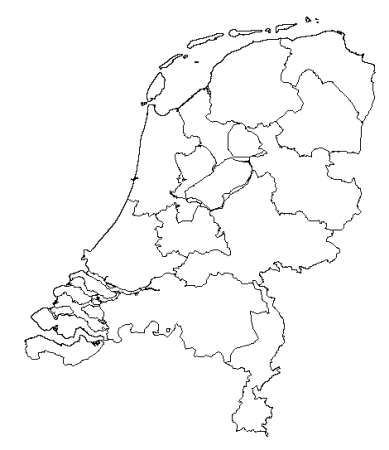
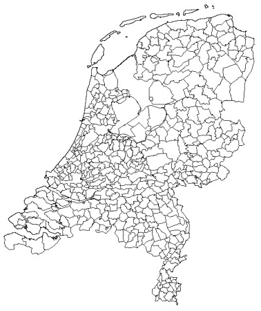
If we decrease the level parameter (level = 0), we’d get an outline of The Netherlands. If we increase the level parameter by one we drill down to ‘gemeentes’
netherlands <- getData("GADM", country = "NLD", level = 2)
Coloring raster maps
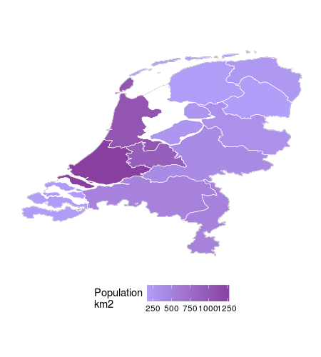
To add color to these map rasters we’ve got to have two layers: one for the outer layer level 1 for example, and one for each piece within that layer, level 2. If we want to plot colors by provinces we’ll need the map of The Netherlands and the map of the provinces:
netherlands <- getData("GADM", country = "NLD", level = 0)
provinces <-  getData("GADM", country = "NLD", level = 1)
To get ggplot to recognise the polygons in the GDAM data we need to convert it to a data frame. Here the fortify comes to our help:
fnetherlands <- fortify(netherlands)
fprovinces <- fortify(provinces)
The fprovinces data frame is enriched with the number of inhabitants per province in 2016. If you want to find out how, download the script.
ggplot(fnetherlands, aes(x = long, y = lat, group = group)) +
  geom_path() +
  geom_polygon(data = tbl_province,
               aes(x = long, y = lat, fill = qty_population_km2)) +
  geom_path(data = fprovinces,
            aes(x = long, y = lat)) +
  scale_fill_continuous(low = "#8FC4FF", high = "#483D7A", na.value = NA)
Combining ggmap with the raster
For the maximum wow factor we’re going to combine the Google map of The Netherlands with the raster plot. To get the Google map of the Netherlands the ggmap library is used which I’ve explained on this page:
map_nld <- get_map(location = "netherlands",
                   zoom = 7,
                   maptype = "terrain",
                   source = "google",
                   color = "color")
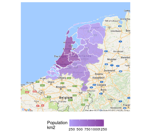
Then the ggmap is combined with the filled raster plot to get this:
ggmap(map_nld) +
  geom_path(data = fnetherlands, aes(x = long, y = lat, group = group), alpha = 0) +
  geom_polygon(data = tbl_province,
               aes(x = long, y = lat, group = group, fill = qty_population_km2), alpha = 0.7) +
  geom_path(data = fprovinces,
            aes(x = long, y = lat, group = group), size = .2) +
  scale_fill_continuous(low = "#8FC4FF", high = "#483D7A", na.value = NA)
Note how the original ggplot function is replaced by a ggmap function. The data and aesthetics then were moved to all the functions plotting the raster data. It is important to repeat the group aesthetic on all layers, since it does not propogate from the main aesthetic, previously set in the ggplot function. If you don’t do this, your map looks more like a broken vase then a map.