This tutorial is the last in a series of four. This part shows you how to apply and interpret the tests for ratio variables with a normal (Gaussian) distribution. This link will get you back to the first part of the series.
A ratio variable has values like interval variables, but here there is an absolute 0 point. 0 Kelvin is an example: there is no temperature below 0 Kelvin, which also means that the 700 degrees Kelvin is twice as hot as 350 degrees Kelvin.
Descriptive
Sometimes you just want to describe one variable. Although these types of descriptions don’t need statistical tests, I’ll describe them here since they should be a part of interpreting the statistical test results. Statistical tests say whether they change, but descriptions on distibutions tell you in what direction they change.
Central tendency
Calculating means is straightforward: just use the mean function:
mean(chickwts$weight)
Output:
[1] 261.3099
Median is usually a better measure for central tendency, but if the variable is truly normally distributed, it should yield about the same result:
median(chickwts$weight)
Output:
[1] 258
Seems pretty close to being normally distributed. But if you want to be sure, you can follow the procedure as discussed in the section Normality check
Distribution spread

The simplest way to describe the spread of a sample is the variance: it measures how far the values are spread around their mean. In oversimplified terms the variance is the mean squared deviation from the mean for each observation.1 Does that make sense? If not, I don’t blame you. Let me break this down:
- Since we want a measure that describes the sample’s spread we are looking how each observation deviates from the sample’s mean; this is the \((x_i - \overline{x})\) part.
- This deviation per observation is then squared, to make sure negative and positive deviations are treated equally when summed. So now we have \((x_i - \overline{x})^2\)
- We sum those deviations for all observations: \({\sum_{i=1}^N (x_i - \overline{x})^2}\)
- Then we calculate the ‘mean’ by dividing it by the sample size minus 1, which gets us the whole formula for variance:
The R function to calculate the variance is var:
var(chickwts$weight)
The standard deviation of the mean (SD) is the most commonly used measure of the spread of values in a distribution. It’s essentially the variance rooted, which makes it easier to interpret than the variance. This makes it the mean absolute deviation from the mean:
\(s = \sqrt{\frac{\sum_{i=1}^N (x_i - \overline{x})^2}{N-1} }\) or \(s = \sqrt{s^2\)}
This is easily done with R’s sd function:
sd(chickwts$weight)
The variance and standard deviation are the metrics used to describe de spread and variability of the data. If you want to know more about the precision of your mean, or when comparing differences between means, the standard error is the metric of choice
sd(x)/sqrt(length(x))
Painting the picture

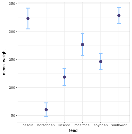
Error bar plot
chickwts %>%
  group_by(feed) %>%
  summarise(mean_weight = mean(weight),
            sd_weight = sd(weight) / sqrt(n())) %>%
  ggplot(aes(x = feed, y = mean_weight)) +
    geom_errorbar(aes(ymin = mean_weight - sd_weight, ymax = mean_weight + sd_weight)) +
    geom_point()
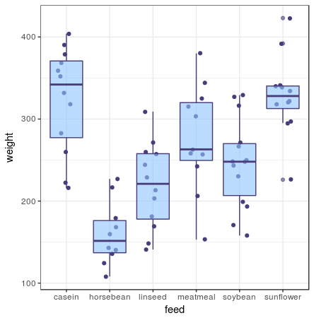
A box plot shows you the median and IQR. For this one I’ve also added the individual data points to get an idea how the box plot represents the data. If you have a lot of data points, this layer makes it way too crowded and I’d omit it.
ggplot(chickwts, aes(x = feed, y = weight)) +
  geom_jitter() +
  geom_boxplot()
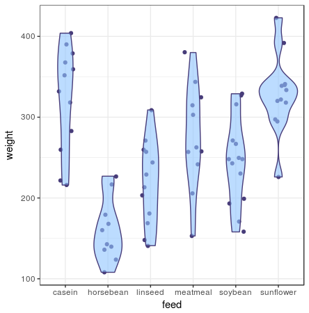
A violin plot gives you a full understanding of the distribution of all your data points. Violin plots draw an area around the datapoints like a density plot would. The number of observations per value are used to draw kernels: the thicker the area of the violin plot, the more observations are in that value range. In this plot I’ve added the individual data points in the geom_jitter layer, but as you can see from the violin plot, they can easily be omitted, since the violin plot captures all data-points, even outliers.
ggplot(chickwts, aes(x = feed, y = weight)) +
  geom_jitter() +
  geom_violin()
One sample
One sample tests are done when you want to find out whether your measurements differ from some kind of theorethical distribution. For example: you might want to find out whether you have a dice that doesn’t get the random result you’d expect from a dice. In this case you’d expect that the dice would throw 1 to 6 about 1/6th of the time.
Normality check

Before you can do any of the tests below, you have to check whether the variable’s distribution is anywhere near the Gaussian distribution. Here I’ll show you how to see if the variables that you intend to test are normally distributed. For this I’ve created two examples: one with and one without normal distribution. For these checks I’ll use three methods to inspect normality: two graphical ones, giving you intuition of the normality, and ‘hard’ method of a statistic normality test outputting a p-value.
For first example I will take a normally distributed value. Since I am lazy, instead of searching for a normally distibuted value in an existing data set, I’ll create a distribution of 500 normally distributed values with the function rnorm:
var_test <- rnorm(500,10,1)
With the first graph I want to get a sence of the distribution of the variable. This graph shows you now many observations each value has with a histogram:
hist(var_test)
Output:
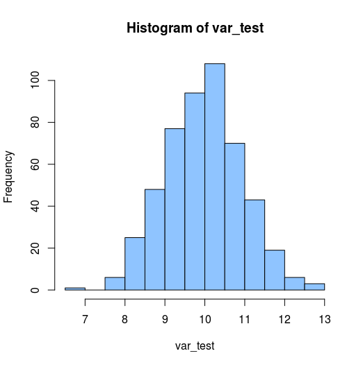
This histogram shows a pretty nice bell-curve like shape, which supports that distribution might be normal.
Another method for checking normality visually which is regularly used is a quantile-quantile (q-q) plot. This plot is a graphical technique for determining if two data sets come from populations with a common distribution by plotting the quantiles of the first data set against the quantiles of the second data set. In this case we just put one data-set as input, while the other is the theorethical normal distribution. The r function qqnorm does exactly that: puts a dataset and compares it to a normal distribution. The function qqline adds the null-hypothesis line, which is the line the qqnorm plot would follow if the data was normally distributed.
qqnorm(y = var_test)
qqline(y = var_test)
Output:
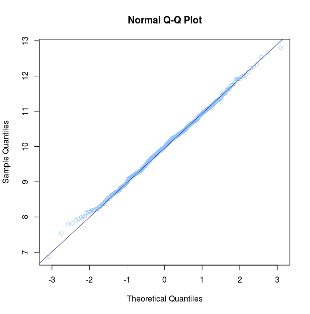
In this Q-Q plot the distribution of points follow the null-hypothesis line almost completely: it tells us the data is normally distributed. The deviations on the end tells us the end of our data’s bell curve are a little more pronounced than expected, but this is not a problem for statistical methods relying on normality of data.
The last method is a statistical test called the Shapiro-Wilk test. This can be checked with R’s shapiro.test function:
shapiro.test(var_test)
Output:
	Shapiro-Wilk normality test

data:  var_test
W = 0.99706, p-value = 0.5099
The p-value, which is much larger than 0.05, tells me the null hypothesis of normally distributed can be maintained.
For the example of a non-normal distribution I’m going to use the miles per gallon statistic from the mtcars data set:
var_test <- mtcars$mpg
I’ve ran all the commands below to get this output:
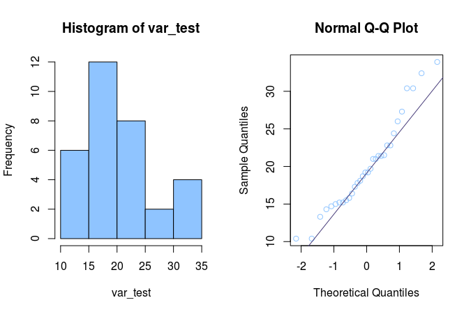
	Shapiro-Wilk normality test

data:  var_test
W = 0.87627, p-value = 7.412e-10
It is clear from the histogram that this is not a normal distribution, since it looks nowhere near a bell shape. I could have stopped here, but to be complete: let’s interpret the rest. The Q-Q plot hits the expected distribution two times, but most of the points are way off the straght line. You can see the large left part of the histogram being reflected in the large left tail in the Q-Q plot. The Shapiro Wilk’s test p-value of 7.412e-10 (much lower than 0.05) also tells me the null hypothesis that this is a normally distributed value should be abandoned.
One sample t-test
A t-test is used to test hypotheses about the mean value of a population from which a sample is drawn. A one-sample t-test is used to compare the mean value of a sample with a constant value. The test can be performed in three ways:
- Testing if the given mean differs from the data set no mather what direction (up from the mean, or down from the mean) this is called a two sided tail test. In this case you do not care about the direction of the deviation of the data set.
- Testing if a given mean is lower than that of the data set (left tailed test). Which is usefull if you want to test whether fill grades for 500 ml bottles does not fall under the 500 ml.
- Testing if a given mean is higher than that of the data set (right tailed test). This is usefull in cases you want to make sure whether the number of students in classes do not pass a certain level.
When you want to use the R function t.test takes for one sample tests, two of the function’s are obligatory:
- x is the vector with values to be tested.
- mu is the average you want to test against.
There are two optional arguments:
- alternative can be either “two.sided”, “less” or “greater”, which let you perform the t-test two sidedly, left tailed or right tailed respectively. The default is the two-sided test.
- conf.level is the confidence level outputted by the t.test. The default is the 95% confidence interval.
Searching for a suitable data set I stumbled across the Davis data set from the car library. It contains heights and weights. I assumed the data set was about random males and females from the U.S., not being hindered by any knowledge or guilt about not wanting to do any research. I wanted to know how the subjects differed from actual weights. I’ve used the average weight data from this wikipedia page. The null hypothesis is the same as usual: the sample distribution follow the mean I provide. Since I want to know whether this set conforms to US, I will perform a two sided t-test. First I’m going to do this for the males:
library(car)

height <- (Davis %>% filter(sex == "M" ))$height
t.test(height, mu = 175.9)
Output:
	One Sample t-test

data:  height
t = 3.0752, df = 87, p-value = 0.002811
alternative hypothesis: true mean is not equal to 175.9
95 percent confidence interval:
 176.6467 179.3760
sample estimates:
mean of x
 178.0114
Looking at the p-value, which is way smaller then 0.05, it seems my assumptions were wrong: this data-set does not represent the average U.S. male in terms of height.
height <- (Davis %>% filter(sex == "F" ))$height
t.test(height, mu = 162.1)
Output:
	One Sample t-test

data:  height
t = 1.4915, df = 111, p-value = 0.1387
alternative hypothesis: true mean is not equal to 162.1
95 percent confidence interval:
 161.5609 165.9213
sample estimates:
mean of x
 163.7411
Looking at the p-value, which is above 0.05, this data-set could be representative of the average U.S. female height. But since my null hypothesis for males doesn’t stick, I highly doubt the whole data set is representative of U.S. height.
Two unrelated samples
Unrelated sample tests can be used for analysing marketing tests; you apply some kind of marketing voodoo to two different groups of prospects/customers and you want to know which method was best.
Unpaired t-test
Again we’ll use the Davis data set. This time we’ll test the alternative hypothesis that men are taller then women. The two samples, women and men, are clearly unrelated data sets. For the unrelated samples t-test we again use the function t.test. THis time we’ll be passing the two samples: one for the males and one for the females. Since out alternative hypothesis suggests directtion we’ll set the alternative parameter value to “less”.
male_height <- (Davis %>% filter(sex == "M" ))$height
female_height <- (Davis %>% filter(sex == "F" ))$height
t.test(female_height, male_height, alternative = "less")
Output:
	Welch Two Sample t-test

data:  female_height and male_height
t = -11.003, df = 179.54, p-value < 2.2e-16
alternative hypothesis: true difference in means is less than 0
95 percent confidence interval:
      -Inf -12.12602
sample estimates:
mean of x mean of y
 163.7411  178.0114
This result with a p-value well below 0.05 shows us, unsurprisingly, that men and women differ in height. We can also review the differences visually:
Davis %>%
  mutate(sex = ifelse(sex == "M", "Male", "Female")) %>%
  ggplot() +
    geom_density(aes(x = weight, fill = sex))
Output:
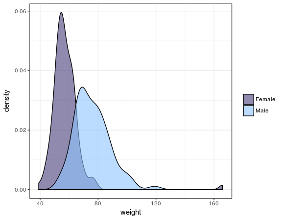
In this plot you clearly see the t-test is right.
Two related samples
The related samples tests are used to determine whether there are differences before and after some kind of treatment. It is also useful when seeing when verifying the predictions of machine learning algorithms.
Paired t-test

For this test we’re going back to the data-set about self reported heights and weights: Davis from the car library. With this set we can see how self reported heights and weights compare to measured heights and weights. Here my alternative hypothesis is that people tend to underreport their weight, hence I’ll use the left tailed test, hence the alternative parameter value “less”. To use the paired t-test we set the value of the paired argument to TRUE. Let’s see what the test says:
t.test(Davis$repwt, Davis$weight, paired = TRUE, alternative = "less")
Output:
	Paired t-test

data:  Davis$repwt and Davis$weight
t = -0.96183, df = 182, p-value = 0.1687
alternative hypothesis: true difference in means is less than 0
95 percent confidence interval:
      -Inf 0.4321098
sample estimates:
mean of the differences
             -0.6010929
The p-value well exceeds 0.05, so it seems my alternative hypothesis is nowhere near significant. It seems the null-hypothesis can be upheld: there is consensus between self reported and measured weight.
Let’s see how this plays out graphically using the geom_density layer, also adding a comparison between females and males:
Davis %>%
  select(sex, weight, repwt) %>%
  gather(measure_reported, weight, c(weight, repwt)) %>%
  mutate(measure_reported = ifelse(measure_reported == "repwt", "Reported", "Measured")) %>%
  mutate(sex = ifelse(sex == "M", "Male", "Female")) %>%
ggplot() +
  geom_density(aes(x = weight, fill = measure_reported)) +
  facet_wrap(~sex, ncol = 1)
Output:
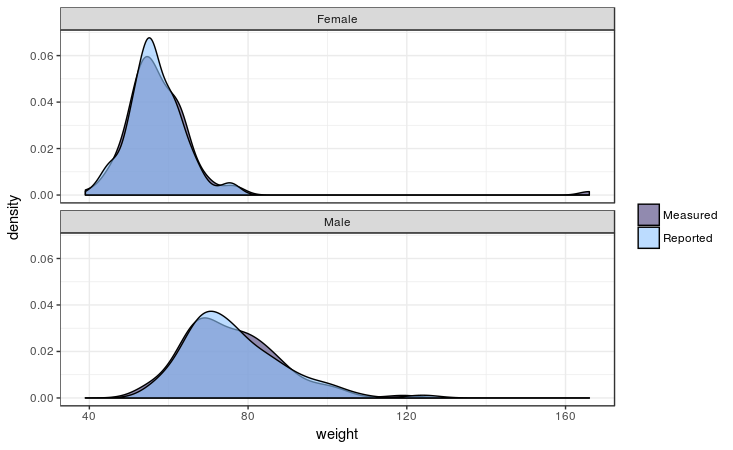
As the test already told us, it seems men and women equally report their weight quite accurately. As you can see there is one female outlier there: she’s 166 kilo’s which she reports as 56… She might have body image issues or a 1 fell off when recording the data…
Association between 2 variables
Tests of association determine what the strength of the association between variables is. It can be used if you want to know if there is any relation between the customer’s amount spent, and the number of orders the customer already placed.
Pearson correlation
The Pearson correlation coefficient is a measure of the strength of a linear association between two variables. Basically, a Pearson correlation attempts to draw a line of best fit through the data of two variables, and the Pearson correlation coefficient, r, indicates how far away all these data points are to this line of best fit (i.e., how well the data points fit this new model/line of best fit).
library(corrplot)
df_corrs <- Davis %>% select(weight:repht)
mat_corr <- cor(df_corrs,
                method = "pearson",
                use = "pairwise.complete.obs")

p_values <- cor.mtest(df_corrs,
                      method = "pearson",
                      use = "pairwise.complete.obs")
corrplot(mat_corr,
         order = "AOE",
         type = "lower",
         cl.pos = "b",
         p.mat = p.values$p,
         sig.level = .05,
         insig = "blank")
First we select only the numerical fields from the data set Davis. The matrix mat_corr contains all Pearson correlation values, which are calculated with the cor function, passing the whole data frame of df_corrs, using the method pearson and only include the pairwise observations. Then the p-values of each of the correlations are calculated using *corrplot**’s cor.mtest function, with the same function arguments. Both are used in the corrplot function, where the order, type and cl.post arguments specify some layout, which I won’t go in further. The argument p.mat is the p-value matrix, which are used by the sig.level and insig arguments to leave out those correlations which are considered insigificant below the 0.05 threshold.

A corrplot shows which values are positively correlated by the blue dots, while the negative associations would indicated by red dots, but this data set has no negative correlations. The size of the dots and the intensity of the colour show how strong that association is. The cells without dot, don’t have significant correlations.
When you make a correlation martrix like this, be on the lookout for spurious correlations. Putting in variables into your model indiscriminately, without reasoning, may lead to some unintended results…
Footnotes
1 The variance is is not actually the mean of all squared deviations from the sample’s mean, since it is divided by the number of observations minus one. If it was an actual mean it would be divided by the number of observations, the number of observations minus 1 it is actually called the degrees of freedom. I consider this a subject that is not inside the scope of this tutorial.
• 0 Comments